Tick Charts are one of my “secret weapons”, and this article explains why.
Tick Charts are not very well known and can be confusing. From time to time, I get questions about Tick Charts, and yesterday’s email from Ken was typical:
I’ve been scouring the Internet for information on tick charts and their ins and outs – but have found nothing useful. Can you please point me to a good source of information with a decent explanation?
Ken
Well, I consider myself a little bit of an expert on Tick Charts, so here goes.
Table of Contents
Use the links above to jump to the Tick Chart topics that interest you.
What is a Tick Chart?
A Tick Chart is a type of trading chart that creates a new bar after a specific number of trades (ticks) occur, regardless of time. For example, a 500-tick chart creates a new bar after every 500 trades, whether that takes 1 minute or 1 hour.
Key Characteristics:
- Trade-based: Bars form based on trading activity, not time
- Volume-sensitive: More bars during high activity periods
- Noise reduction: Filters out periods of low activity
- Professional tool: Popular with scalpers and momentum traders
What is the $TICK chart?
The $TICK (NYSE TICK Index) is completely different from Tick Charts. $TICK measures stocks trading on upticks vs downticks across the entire NYSE. It’s a market breadth indicator, not a price indicator. Don’t confuse it with tick-based price charts discussed in this article.
Tick Charts vs Time Charts: Comparison Table
| Feature | Tick Charts | Time Charts |
|---|---|---|
| Bar Formation | After X trades complete | After fixed time period |
| Market Noise | Filters low activity periods | Shows all time periods equally |
| Best For | Scalping, momentum trading | Swing trading, position trading |
| Volume Analysis | Shows average trade size | Shows total volume per period |
| Professional Usage | High among futures traders | Standard for most traders |
| Learning Curve | Steeper | Easier for beginners |
| Data Requirements | Quality tick data needed | Standard data sufficient |
| Lunch Hour Display | Compressed (fewer bars) | Many low-activity bars |
| Breakout Timing | Earlier entry signals | Waits for the bar to close |
| Platform Support | Limited (premium feature) | Universal |
Use Tick Charts When:
- Scalping futures (ES, NQ, YM)
- Trading during news events
- Need precise entry/exit timing
- Trading highly liquid markets
- Want to filter market noise
Use Time Charts When
- Swing or position trading
- Trading stocks/ETFs
- Need a consistent time analysis
- Following time-based patterns
- Limited budget for data
How do I calculate the Tick Chart equivalent of a 5-minute chart?
To find the Tick Chart equivalent of a 5-minute chart, you’ll need to analyze the average trading activity for your specific market. Start by setting up a 24-hour (daily) chart of your instrument and adding a volume indicator to it. This is crucial: make sure your symbol settings display “Tick Count” rather than “Trade Volume” – many traders miss this step and get incorrect calculations.
Next, you need to know how many hours per day your market actually trades. The Emini and most CME futures trade for 23 hours daily, while agricultural contracts vary significantly; for instance, orange juice futures only trade for 6 hours per day.
Once your chart is set up correctly, take the average of the volume indicator over the last 100 days or so. This is the average daily tick count for your instrument. Then divide this by the number of trading hours to get ticks per hour, then divide that result by 12 to get your 5-minute equivalent.
5 Advantages of Tick Charts for Day Trading
I much prefer Tick Charts over conventional, time-based charts. Here are my 5 reasons why.
#1 Follow the Professionals
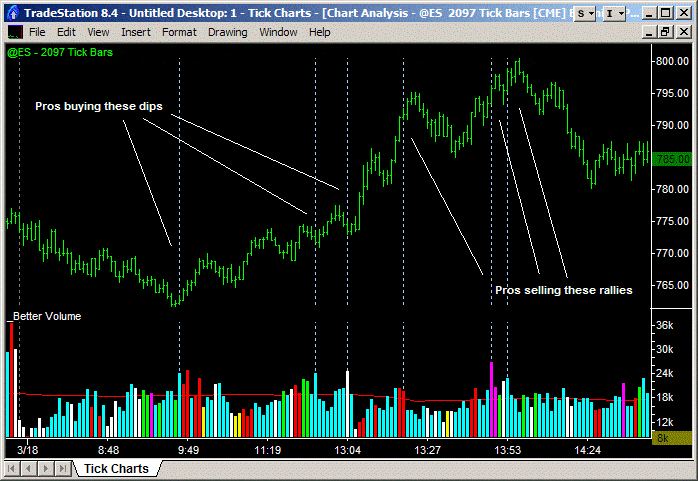
The Emini is a perfect trading vehicle because we know the number of contracts in each individual trade. On a Tick Chart, when we plot volume, we see the total number of contracts traded during the last, say, 100 trades. The relative size of the volume histogram shows us the average trade size. Let’s take an example.
If during the last 100 trades the average number of contracts in each individual trade was 2, the volume histogram would show a value of 200. However, if during the last 100 trades the average number of contracts in each individual trade was 25, then the volume histogram would show a value of 2,500. So, if the volume histogram is low, we are seeing Amateurs trading, and if the volume histogram is high, we are witnessing Professionals.
The 2,097 Tick Chart above highlights some of the high-value bars, which indicate large average trade sizes or those of Professionals. As you can see, you want to follow the Professionals. They were buying the dips and shorting the rallies.
#2 Fade the Amateurs
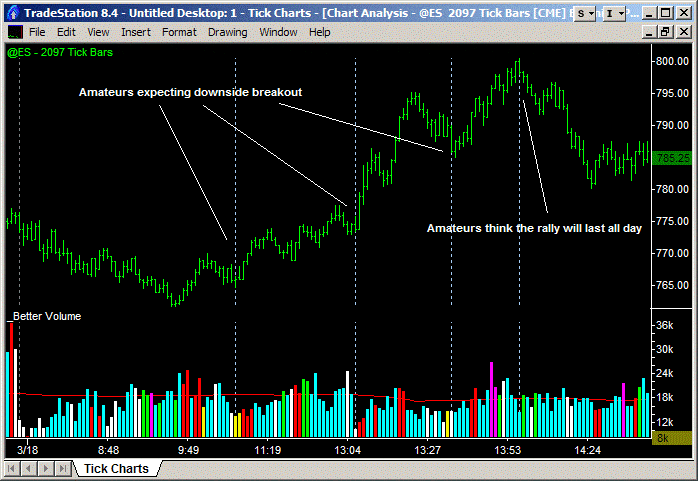
Similarly, looking out for low-value bars allows you to identify what the Amateurs are doing. The 2,097 Tick Chart above is identical to the previous chart, but with some of the low-value bars highlighted. These show small average trade sizes or Amateurs. As you can see, you want to fade (i.e. do the opposite of) the Amateurs. They were shorting the dips and buying late into the rallies.
If you want to know more about following the Professionals and fading the Amateurs, check out the Better Pro Am indicator.
Now, I think that information alone would be reason enough to use Tick Charts, but there’s more…
#3 Earlier Breakout Entries
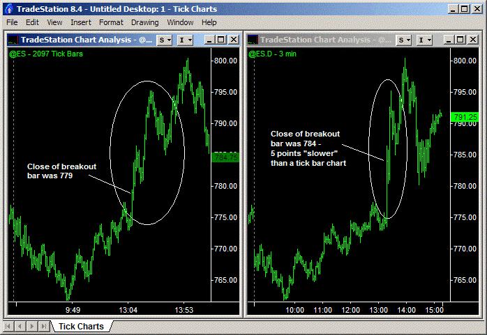
If you’re waiting for the close of a bar to enter a trade, say a breakout, a Tick Chart will get you in earlier. The Emini trading chart above illustrates the point. The Emini spiked up on FOMC-related news. Using a Tick Chart, you could see the surge in activity and enter at the bar’s close, say 779. With say a 3 minute chart the entry on close would have got you in closer to 784 – or 5 points worse off!
Hi Barry, I used to use 1 min, 5 min, 15 min charts etc. but found time to be inadequate due to changes in volatility. I would be profitable for 2 months and then boom, volatility spikes up and all of sudden, my trading is not good. Switching to 1500-tick and 4500-tick has completely masked the volatility differences and allows me to trade more consistently regardless of the volatility.
John G.
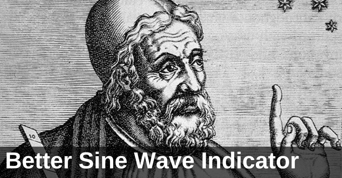
#4 Better Cycle Analysis
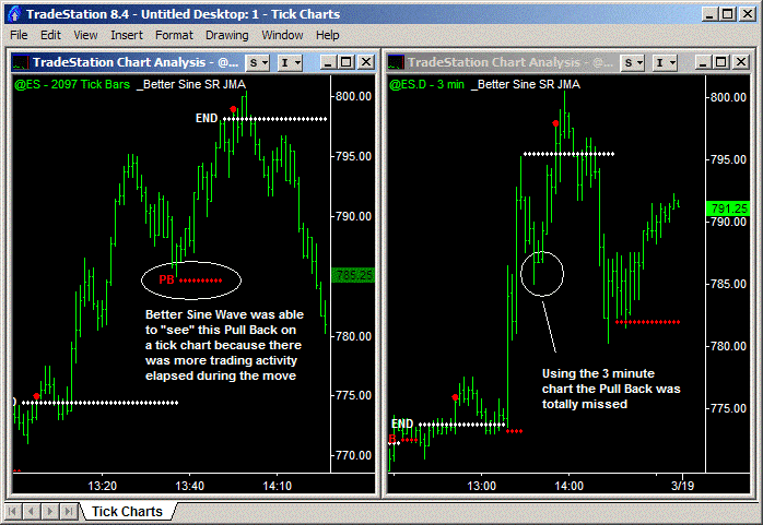
A Tick Chart will also allow you to “see” more trade information and work particularly well with cycle analysis. In the example above, the Better Sine Wave, my preferred cycle analysis tool, was able to pick out a Pull-Back long entry point in the 2,097 Tick Chart. However, with the 3-minute chart, the Pull-Back was missed entirely.
#5 Compressed Low-Activity Periods
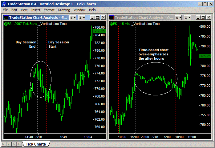
Lastly, a Tick Chart compresses low-activity periods, such as lunchtime, after-hours trading, and overnight trading. This reduces whipsaws and allows more “continuous” analysis between days, with trades setting up pre-open on a Tick Chart. Or fewer false break-out trades during lunchtime.
3 Disadvantages of Tick Charts You Should Know
While I’m a strong advocate for Tick Charts, it’s essential to understand their limitations before making them your primary charting method. Here are three significant disadvantages that every trader should consider:
- Heavy CPU Processor Load: Tick Charts are resource-intensive and can slow down your trading computer, especially if you’re running multiple charts simultaneously. The solution is to either invest in a more powerful trading computer with a fast processor and plenty of RAM or limit the number of Tick Charts you have open simultaneously.
- Data Feed Inconsistencies Between Platforms: As mentioned later in this article, no two tick data feeds are identical. This creates a frustrating situation where your 500-tick chart on TradeStation might look completely different from a 500-tick chart on NinjaTrader for the same instrument. The differences arise from how each data provider aggregates trades and filters data.
- Limited Historical Data Availability: A significant limitation of Tick Charts is the difficulty in generating historical charts that extend beyond a few weeks. While you can easily pull up a 5-minute chart from 2 years ago, trying to load a 500-tick chart from the same period is often impossible. Most data providers limit historical tick data or charge for it. This limitation makes backtesting strategies on Tick Charts challenging.
Despite these disadvantages, I still believe the benefits of Tick Charts outweigh the drawbacks for active day traders. Invest in up-to-date hardware, stick with one reliable platform, and use time-based charts for longer-term analysis while reserving Tick Charts for your real-time trading decisions.
Best Tick Chart Settings by Market (2025)
Quick Comparison Table
| Market | Instrument | Scalping (ticks) | Day Trading (ticks) | Swing Trading (ticks) |
|---|---|---|---|---|
| Futures | ES (Emini S&P500) | 500 | 1,500 | 4,500 |
| Futures | NQ (NASDAQ) | 250 | 750 | 2,250 |
| Futures | CL (Crude Oil) | 300 | 900 | 2,700 |
| Futures | GC (Gold) | 200 | 600 | 1,800 |
| Forex | EC / 6E (Euro) | 500 | 1,500 | 4,500 |
| Forex | BP / 6B (British Pound) | 250 | 750 | 2,250 |
| Forex | JY / 6J (Japanese Yen) | 400 | 1,200 | 3,600 |
| Forex | AD / 6A (Aussie Dollar) | 250 | 750 | 2,250 |
| Crypto | BTC (Bitcoin) | 500 | 1,500 | 4,500 |
| Crypto | ETH (Ethereum) | 500 | 1,500 | 4,500 |
Choosing the right Tick Chart setting for your trading is more of an art than a science. The table above should help you get going. However, be sure to review this annually or semi-annually, as trading volumes fluctuate from year to year.
What is the best Tick Chart setting for ES trading?
The three best Tick Charts for Emini (ES) day trading are the 500-tick, 1,500-tick and 4,500-tick Charts.
I use these in my multiple time frame (MTF) analysis of the Emini:
- The lowest timeframe (500-tick) is excellent for timing an entry or exit.
- The intermediate timeframe (1,500-tick) is excellent for identifying the trend direction.
- The highest timeframe (4,500 -tick) allows you to see the big picture.
What is the best Tick Chart setting for NQ trading?
The three best Tick Charts for NQ (NASDAQ futures) day trading are the 250-tick, 750-tick and 2,250-tick Charts.
Although NQ futures are very popular (mostly among Amateur traders) due to their higher volatility, the truth is that they trade roughly half of the daily volume of Emini futures. So the Tick Chart settings are also half the Emini values.
Can I use Tick Charts for Forex trading?
Yes, you can use Tick Charts for Forex trading, but only with Forex futures contracts (EC/6E, BP/6B, JY/6J, etc.).
With “traditional” cash Forex charts, we only know the number of trades during a period of time and not the number of contracts traded. On a Tick Chart, when we plot volume, there is no indication of trade volume size. If you want volume information on a cash Forex chart, you’ll have to stick with conventional time-based charts and plot tick count as a proxy.
However, there is another option – futures Forex contracts traded on the CME. These contracts have grown rapidly and are now large enough to be representative of what happens in the cash Forex market. The advantage of these futures contracts is that complete volume data is available, and Tick Charts work great.
What is the best Tick Chart setting for Forex trading?
You need to adjust your Tick Chart settings for Forex contracts based on the relative activity of that contract.
For example, the Euro is the most liquid Forex market, followed by the Japanese Yen, British Pound, and then the Aussie Dollar. So the Euro would have the highest tick setting and the Aussie the lowest. These forex futures recommended tick settings work well:
- EC / 6E (Euro): 500, 1500, 4500-tick
- BP / 6B (British Pound): 250, 750, 2250-tick
- JY / 6J (Japanese Yen): 400, 1200, 3600-tick
- AD / 6A (Aussie Dollar): 250, 750, 2250-tick
There’s more information on using the ‘Better’ series of indicators on Forex charts here.
Improved Continuous Contract Symbols
If you’re a TradeStation user and you trade Forex futures, we recommend using optimized continuous contract symbols that roll on the 2nd day before expiry, when volume shifts to the new front-month contract. For example, to do this for Euro futures use:
- Tick Charts: @EC=102XC
- Minute Charts: @EC.D=102XC
This avoids TradeStation’s default 3rd-day roll, which can include data from the prior, less liquid contract.
Platform Setup Guides
Tick Charts and TradeStation
Setting up Tick Charts in TradeStation 10 is simple once you know where to look. Right-click on any chart and select “Data” and then “Edit Symbol”. In the Customize Symbol window, navigate to the “Settings” tab at the top. Under the “Interval” section, click on the “Tick” option. Then, in the “Interval Setting” field, enter your desired tick count (such as 500, 1500, or 4500).
After entering your tick value, make sure to check the “For Volume, Use” dropdown and set it to “Trade Vol” instead of “Tick Count” – this ensures your volume indicators display actual contract volume rather than tick count. Click OK to apply your changes, and the chart will immediately convert to your specified tick interval.
This drives traders crazy, and I receive emails about it on a weekly basis. Your volume histogram appears incorrect on a TradeStation Tick Chart with bars that are all the same height! This is easily fixed.
Fixing Tick Charts on TradeStation
Right click on the chart > select Data > Select Edit Symbol > go to the Settings tab > under ‘For Volume Use’, you’ll see a pull-down menu > change the setting from Tick Count to Trade Vol > OK.
Now, the volume indicator on your Tick Chart will reference the trade volume data instead of the tick count data.
If your Tick Charts are slow to load, your symbol data cache may have become corrupted or bloated. The solution is to rebuild your cache – I do this every 2 to 3 weeks or when I notice my Tick Charts are slow to load. This article on TradeStation charts explains the steps for rebuilding your cache.
Tick Charts and NinjaTrader
Setting up Tick Charts in NinjaTrader is straightforward. Right-click anywhere on your chart and select “Data Series” from the context menu, which opens the Data Series configuration window. In the “Type” dropdown menu, change from the default “Minute” to “Tick” – you’ll find this in the upper portion of the window.
Once you select Tick, a new field labeled “Value” appears where you enter your desired tick count, such as 500, 1500, or 4500 for the Emini. Ensure you adjust the “Days to Load” parameter. Click OK to apply the changes, and your chart will immediately convert to the tick-based view. For efficiency, save this as a chart template by right-clicking the chart, selecting “Templates” then “Save As” so you can quickly apply these settings to new charts.
Tick Charts and Interactive Brokers
The Interactive Brokers (IB) data feed available via their Trader Workstation Software (TWS) is not a true tick-by-tick data feed. IB provides snapshots of the trade data several times a second, aggregating the trades that took place during that interval. As a result, time-based charts (e.g. 5-minute charts) will be correct; however, a Tick Chart constructed using IB data will not.
Do Tick Charts work on TradingView?
TradingView (developed by the makers of MultiCharts) is the future of charting software. What makes it different is that it’s 100% web-based – it’s not a standalone piece of software that requires coding for Windows or macOS and installation on your laptop. You open your web browser and access the TradingView charts and indicators.
However, TradingView is not ready for “professional” trading. It has excellent coverage of almost all instruments and exchanges (including all CryptoCurrencies). But it has two failings. One is that the data can change when you reload a chart in real-time. This is almost a fatal flaw.
Secondly, Tick Charts are not yet fully available on TradingView. After much pressure from traders, TradingView released a beta version of Tick Charts in August 2024. For professional-tier plans (Expert and Ultimate), four tick intervals are available: 1-tick, 10-tick, 100-tick, and 1,000-tick. In addition to this limitation, not all exchanges that TradingView covers currently have tick data.
This is an excellent start by TradingView, and I encourage them to keep expanding their Tick Chart functionality.
Do Tick Charts work on MT4/MT5?
Unfortunately, Tick Charts are not natively supported in either MT4 or MT5. This is one of the most significant limitations of the MetaTrader platforms for futures and forex traders. MetaTrader was designed primarily for forex trading, where time-based charts are the standard. While MT5 does offer some improvements over MT4 (including real volume data for exchange-traded instruments), neither platform includes built-in Tick Chart functionality.
Why do my Tick Charts look different on different platforms?
Unfortunately, no two tick data feeds are the same. Different data providers aggregate trades differently, and the trade count can be:
- Filtered by the data feed provider
- Set to start recounting at different starting points (e.g. midnight, open, etc.)
- Aggregated to reduce bandwidth requirements by the data feed provider
- Missing trades because of your momentary Internet disconnects
- Processed out of sequence because of multi-threading on your computer, etc.
This is why you’ll never get two Tick Charts using different data feeds to match up exactly. Frustrating – I know. But that’s life in the big city. However, for me, the advantages of a Tick Chart far outweigh this negative.
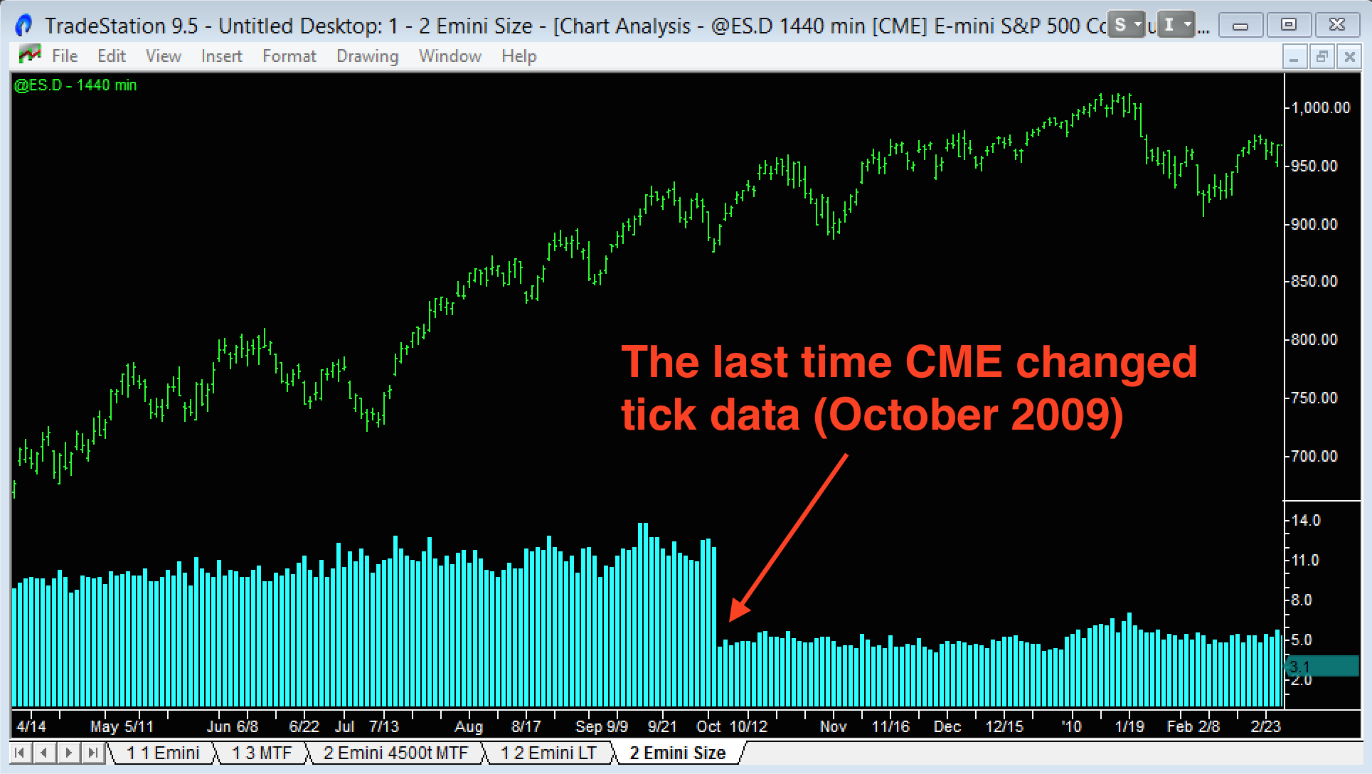
Believe it or not, the CME even had problems in the past defining what a “trade” and hence a “tick” was.
If a buyer steps in and picks up 3 orders each of 5 contracts sitting at the Ask, he is viewed as the ‘aggressor’ and in a ‘bundled‘ data feed this would be shown as: 1 trade for 15 contracts done at the Ask. In an ‘un-bundled‘ data feed this would be shown as: 3 trades each for 5 contracts done at the Ask.
In October 2009, the CME “unbundled” trades, resulting in the average trade size dropping from approx. 11 to 5 contracts (see the chart above). Before the change, my Emini chart setup used 233, 699 and 2,097 ticks. 233 is a Fibonacci number, and that’s why it was my starting point. After the change, I switched to my current chart settings of 500, 1,500 and 4,500 ticks.
5 Key Takeaways from the Tick Charts Guide
Tick Charts create bars based on trades, not time: A 500-tick chart forms a new bar every 500 trades, regardless of whether that takes 30 seconds or 30 minutes, filtering out low-activity periods and providing cleaner price action during volatile markets.
Professional traders leave footprints through volume: Large volume bars on Tick Charts indicate Professional activity (hedge funds and institutions buying dips and selling rallies). In contrast, small volume bars reveal Amateur traders doing the opposite, giving you an edge by following the smart money.
Optimal settings vary by market liquidity: Use 500/1,500/4,500 ticks for liquid markets like ES and Euro futures, but scale down to 250/750/2,250 for less liquid markets like NQ or British Pound futures to maintain consistent bar formation.
Platform support is limited but improving: While TradeStation and NinjaTrader offer full Tick Chart functionality, popular platforms like MT4/MT5 don’t support them natively, and TradingView only recently added basic tick intervals for premium users.
Data feed differences create inconsistencies: Tick Charts will never match perfectly between platforms due to how different data providers aggregate trades, but that’s a small price to pay for the advantages Tick Charts bring.