I’m surprised I haven’t looked at this relationship before – the relationship between Equities and the Japanese Yen. This is the classic “Carry Trade”. Borrow in a low interest rate country and invest the money in higher yielding assets abroad.
Traditionally Japan has been the place to borrow because of it’s near zero interest rates. However, in the last cycle the US has also become an attractive country to borrow. Then investible assets abroad could be almost anything: bonds, equities, even property.
What can go wrong? As long as interest rates stay low and the borrowing currency doesn’t move against you the trade is easy money. But if interest rates start to rise and/or the borrowing currency strengthens then the trade can quickly go bad. This scenario – a Carry Trade Unwind – then leads to selling of assets, repatriation of funds and paying down of debt or margin.
Equities are inversely correlated to the Yen
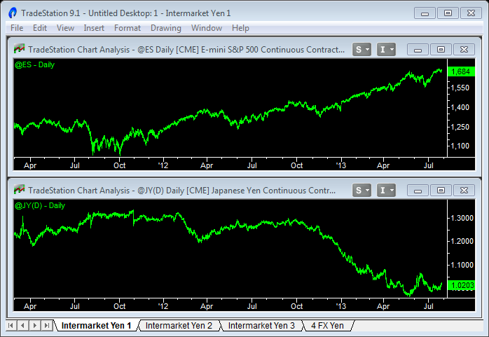
The Carry Trade has become systematic – I can’t find figures to say how large it is, but it’s huge. And every time the Yen declines it “encourages” speculators to load up, take on more risk, buy more bonds and equities. Because now they’re making money on the Forex portion of the bet too. So you’ll see an inverse relationship between the Japanese Yen and risk assets like US Equities – as the Yen falls, equities rise. And this has been particularly pronounced during the last 6 months as the Yen as fallen 30% (see the chart above).
This simple Oscillator uses the difference in rate of change
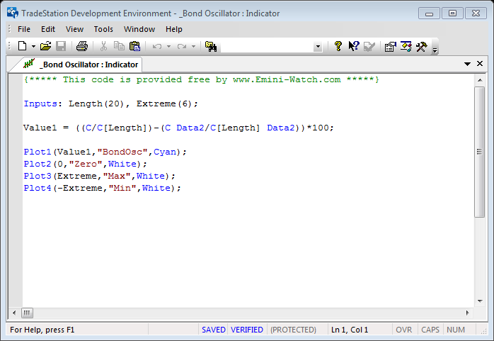
You might have seen this indicator before – I use it in my Equities vs Bonds analysis. I much prefer it to the canned “spread” type indicators. It measures the rate of change of each market and then calculates the difference between the two – giving areas of over-bought and over-sold. You can adjust the lookback period, but I like using a typical cycle period of 20 bars.
Use ETFs for Intermarket Analysis in TradeStation
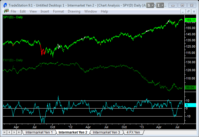
TradeStation is pretty strict about combining symbols from different time zones (or delayed symbols). So I use ETFs that track the underlying markets in any intermarket analysis – in this case the SPY (tracks the S&P500) and FXY (tracks the Japanese Yen). The chart above shows the Oscillator and areas of over-bought and over-sold marked on the price bars with white and red paintbars. The extreme differential values that seem to make sense are +/-10 – which is a 10% differential between the markets using a lookback of 20 days (or a month).
Longer term trends can also be seen
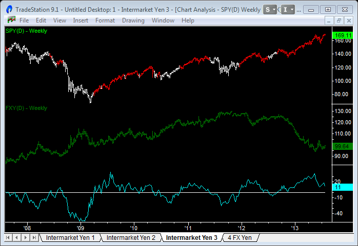
You can also use the Oscillator to show long term trends. Apply the indicator to a weekly chart and then use crosses of the zero line to signal changes in trend. In fact, the zero cross is confirmation (and a fraction late) as the trend can start to reverse as the oscillator moves back towards zero. In effect we’re measuring the flow of funds in and out of Japan and in and out of Equities. Currently (late July 2013), this trend appears to be reversing as the Oscillator is moving back towards the zero line.
Use the ‘Better’ indicators on the Japanese Yen
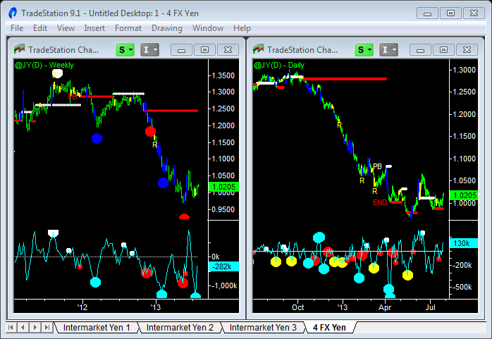
I’d never use intermarket analysis alone to take trades – only to set the big picture and see what might be happening with international capital flows. My suggestion would be to confirm changes in trend in the Japanese Yen using the ‘Better’ indicators and then factor that into the medium/long term trend in Equities and the Emini.
At the moment (late July 2013) we’ve had a huge (30%) decline in the Yen and found exhaustion volume and done some basing around parity with the US Dollar. We’re still in a downtrend on the weekly chart but we’ve got to bounce back up to resistance and form a Pull Back in a downtrend.
Any strength in the Yen over the next couple of weeks could trigger trailing stops and cause a short covering rally that could propel us up to that Pull Back level. The Yen strength would also cause a temporary unwind of the Carry Trade and weakness in Equities. Let’s see how it plays out during August and September.
I hope you found this article on the Japanese Yen Carry Trade helpful. Follow this link to download the Intermarket Oscillator used in the charts above.


