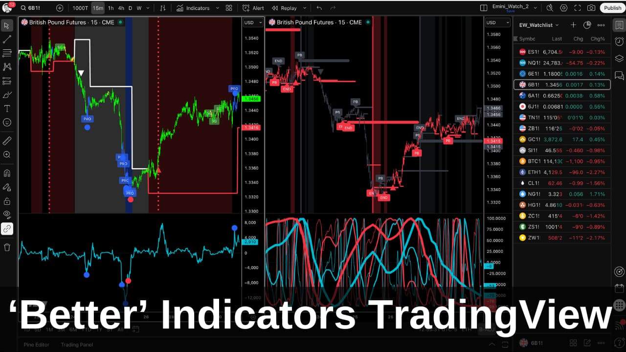
Traditional momentum indicators measure price. But price is the result, not the cause. A volume momentum indicator measures buying and selling volume – the actual driving force that moves markets. That’s why I built Better Momentum.
Better Momentum is my most valuable trading tool.
Jack B.
You make volume as visual as price.
Ralph R.
I am sold on your Better Momentum indicator.
Steve McG.
Table of Contents
Use the links above to jump to the Volume Momentum Indicator topics that interest you.
The Problem with Price-Based Momentum
The traditional momentum indicator has been around forever. The typical code looks like this:
// Traditional Momentum Indicator Code

Inputs: Price(Close), Length(12);
Variables: MyMomentum(0);

MyMomentum = Price - Price[Length];

Plot1(MyMomentum,"Momentum");
Plot2(0,"Zero");
It calculates the difference between closing prices a set distance apart. Simple. And fundamentally flawed.
Here’s why: you’re measuring the result of market activity, not the cause. When you measure price momentum, you’re looking in the rearview mirror. The move has already happened.
RSI, Stochastic, and MACD all suffer from the same problem. They’re all derived from price. They’re all lagging by definition.
In years gone by, this was the only option. The only timely data traders had was price data. Volume data was either unavailable or delayed.
But times have changed.
Modern data feeds don’t just show you volume – they show you the volume of every single trade and whether it took place on the bid or the ask. You can now see buying volume (demand) and selling volume (supply) in real-time.
So why would you still use a momentum indicator based on price?
Volume Leads Price
Here’s the core philosophy behind a volume momentum indicator: volume is the fuel that powers market moves.
Think of it like a car. Price is the speedometer – it tells you how fast you’re going. Volume is the fuel gauge – it tells you whether you can sustain the speed or if you’re about to stall.

Volume activity often precedes price action. Exhaustion in buying or selling volume shows up before the price turn becomes obvious on a chart. This gives you an edge – you can identify turns before they happen rather than chasing after them.
A volume momentum indicator measures the net buying and selling pressure. When buyers are aggressively hitting the ask, you see it. When sellers are dumping on the bid, you see that too. You’re watching the actual battle between supply and demand, not just the aftermath.
Price-Based vs. Volume-Based: A Side-by-Side Comparison
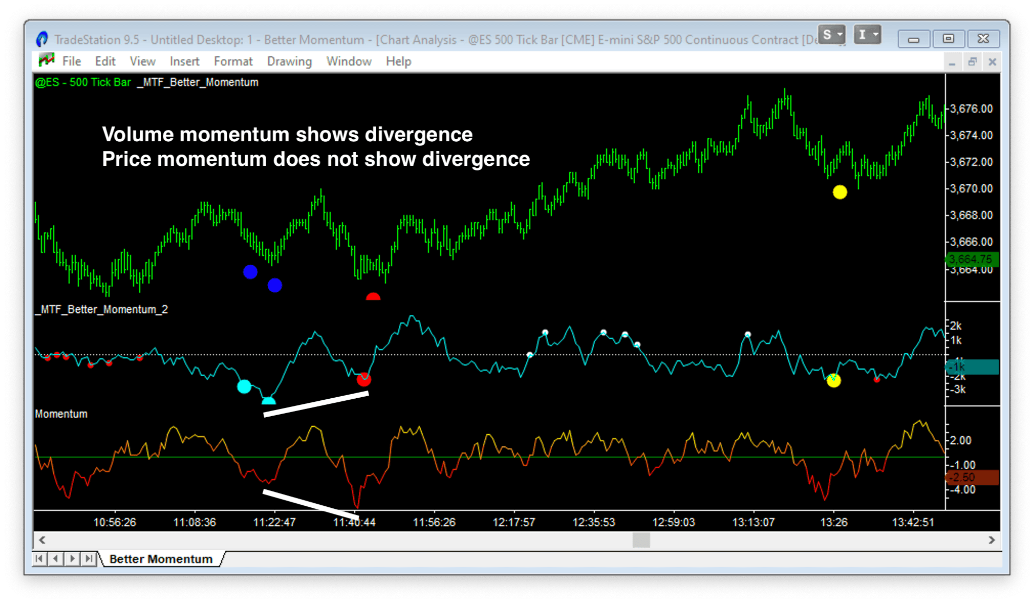
The chart above shows a 500-tick bar chart of the Emini with a volume-based momentum indicator (Better Momentum) alongside a conventional price-based momentum indicator using default TradeStation settings.
Look at the highlighted turning point.
The volume momentum indicator correctly identified fewer sellers participating in the move – a clear signal that a reversal was likely. The traditional momentum indicator missed it entirely. It showed nothing unusual because it was only measuring price, which was still making lower lows.
Not all turning points will be this clear-cut. Sometimes price-based momentum mirrors volume-based momentum. But when they diverge, volume momentum gives you the early warning that price momentum misses.
If you have the choice, why settle for a proxy measurement when you can measure the driving force directly?
The Three Signals That Identify Reversals
Better Momentum generates three specific signals that follow the progression of a trend change:
- Exhaustion (blue dots) – the climax
- Divergence (red/white dots) – the setup
- Flush (yellow dots) – the final shakeout
These signals are plotted on both the price bars and on the volume momentum histogram in the charts below.
Exhaustion Patterns: The End of a Move
Exhaustion Sell (Blue Dot at Lows)
A high-volume spike to the downside indicates panic selling or capitulation. This often marks a market bottom – the final sellers are joining in. Everyone who wanted to sell has sold.
Exhaustion Buy (Blue Dot at Highs)
A high-volume spike to the upside indicates a buying climax or “blow-off” top. Latecomers are rushing in, paying any price. This is often the end of the rally.
The Mirroring Principle
Markets tend to run from exhaustion to exhaustion. If a move starts with an Exhaustion Sell, look for an Exhaustion Buy to end the subsequent rally. And vice versa.
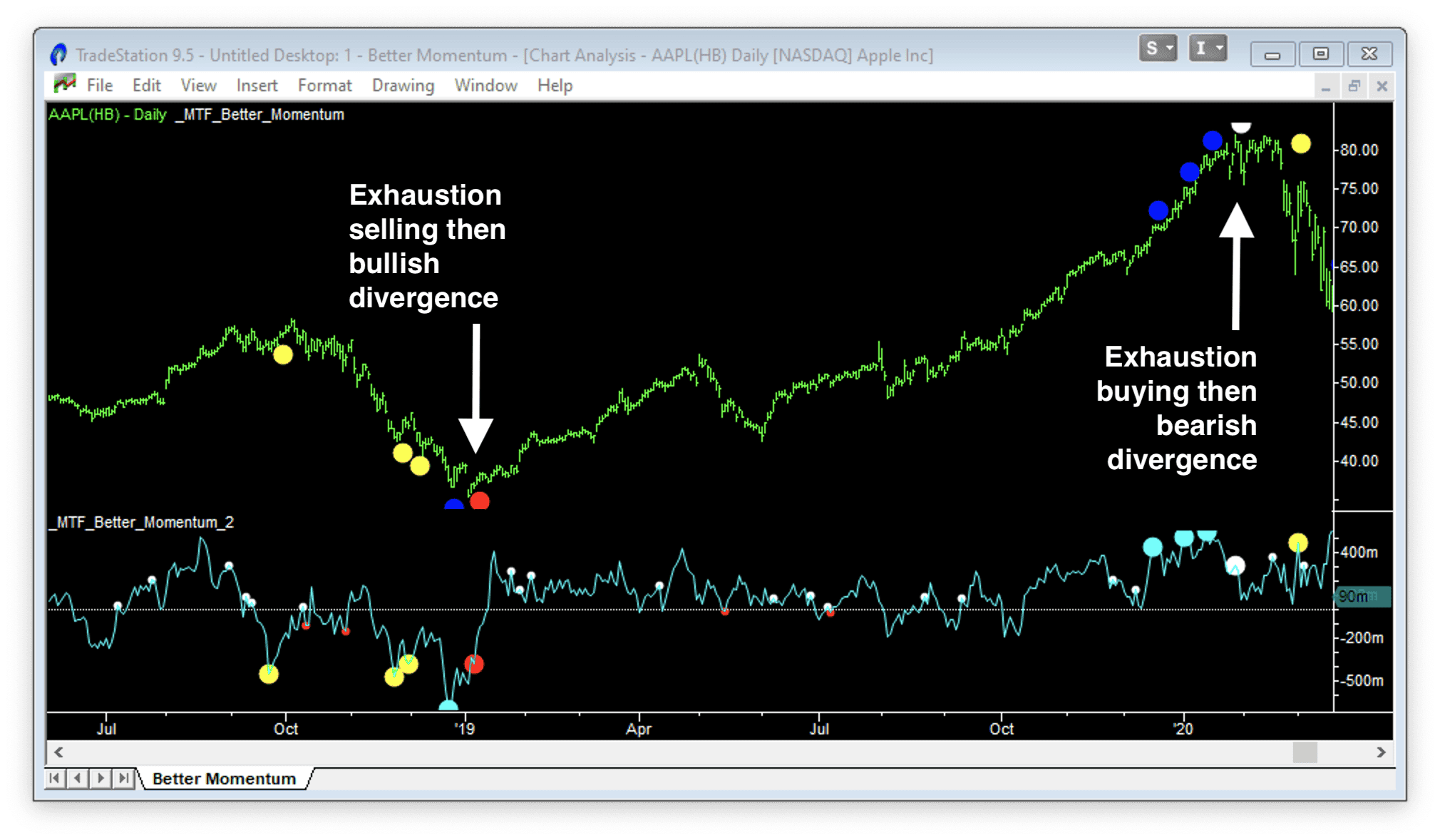
Important: Never enter a reversal trade when exhaustion signals appear. They show the “blow off” buying or “panic” selling that gets a large number of traders incorrectly positioned. They’re part of the setup, not the trigger.
Divergence Patterns: The Reversal Setup
Bullish Divergence (Red Dot)
Occurs at lows when price makes a lower low (or similar), but the volume momentum indicator makes a higher low. Despite the weaker price, selling pressure is waning. The fuel is running out on the downside.
Bearish Divergence (White Dot)
Occurs at highs when price makes a higher high (or similar), but momentum makes a lower high. Despite the stronger price, buying pressure is weakening. The rally is running on fumes.
The Classic Setup
An Exhaustion signal followed by a Divergence signal is your reversal setup. Exhaustion shows you the climax. Divergence confirms that the pressure is fading.
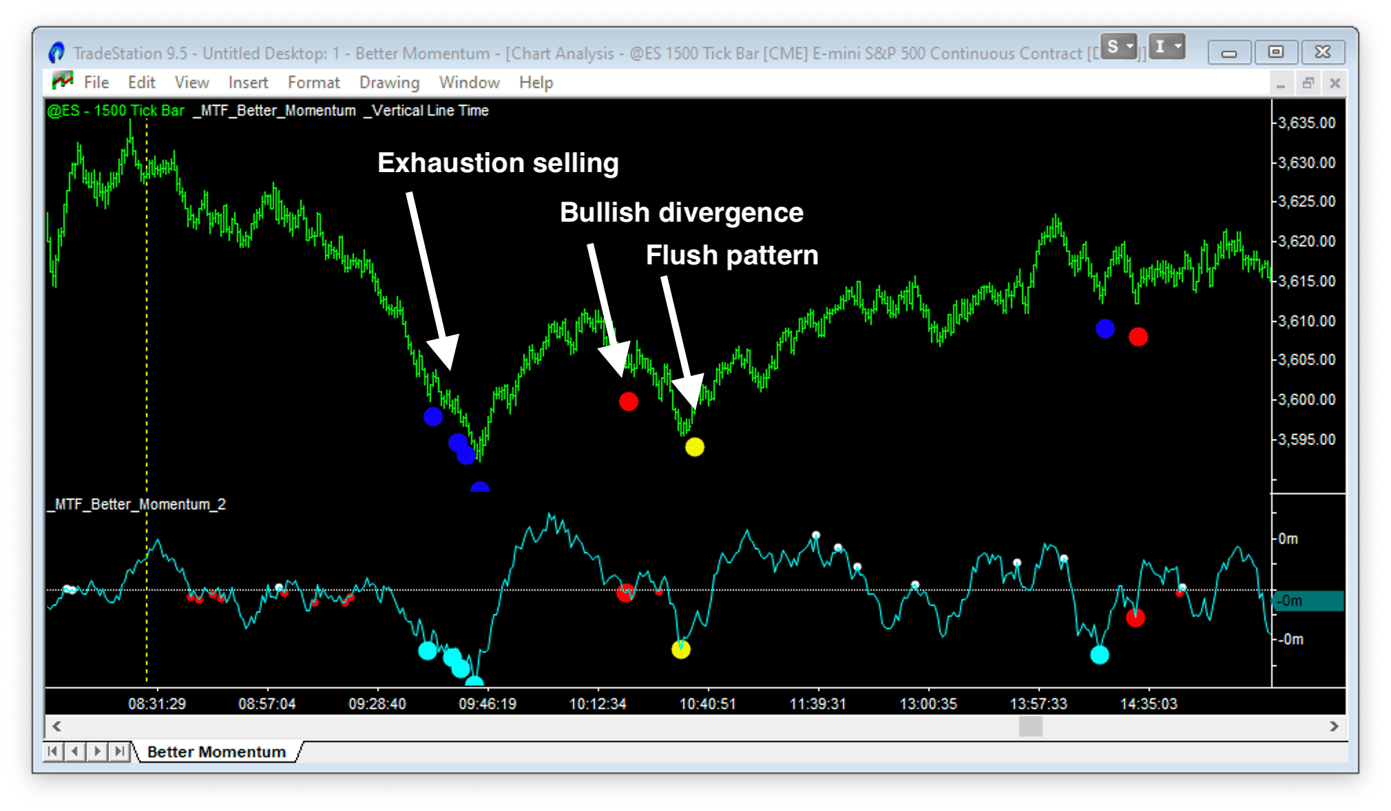
The divergence algorithm in Better Momentum is sophisticated – it doesn’t just compare the current peak to the previous peak. It compares the current peak to a statistically significant prior peak, reducing false signals.
Flush Patterns: The Final Shakeout
Here’s a nuance most traders miss:
If a Divergence signal appears very close to the zero line, it’s often not strong enough to turn the market immediately. The momentum hasn’t built up enough to counteract the opposing force.
In these cases, expect one final push – a “flush” that clears out remaining stops. Better Momentum marks this with a yellow dot.
The Flush pattern often acts as the final low or high before the turn. It’s the market’s way of shaking out the last weak hands before reversing.
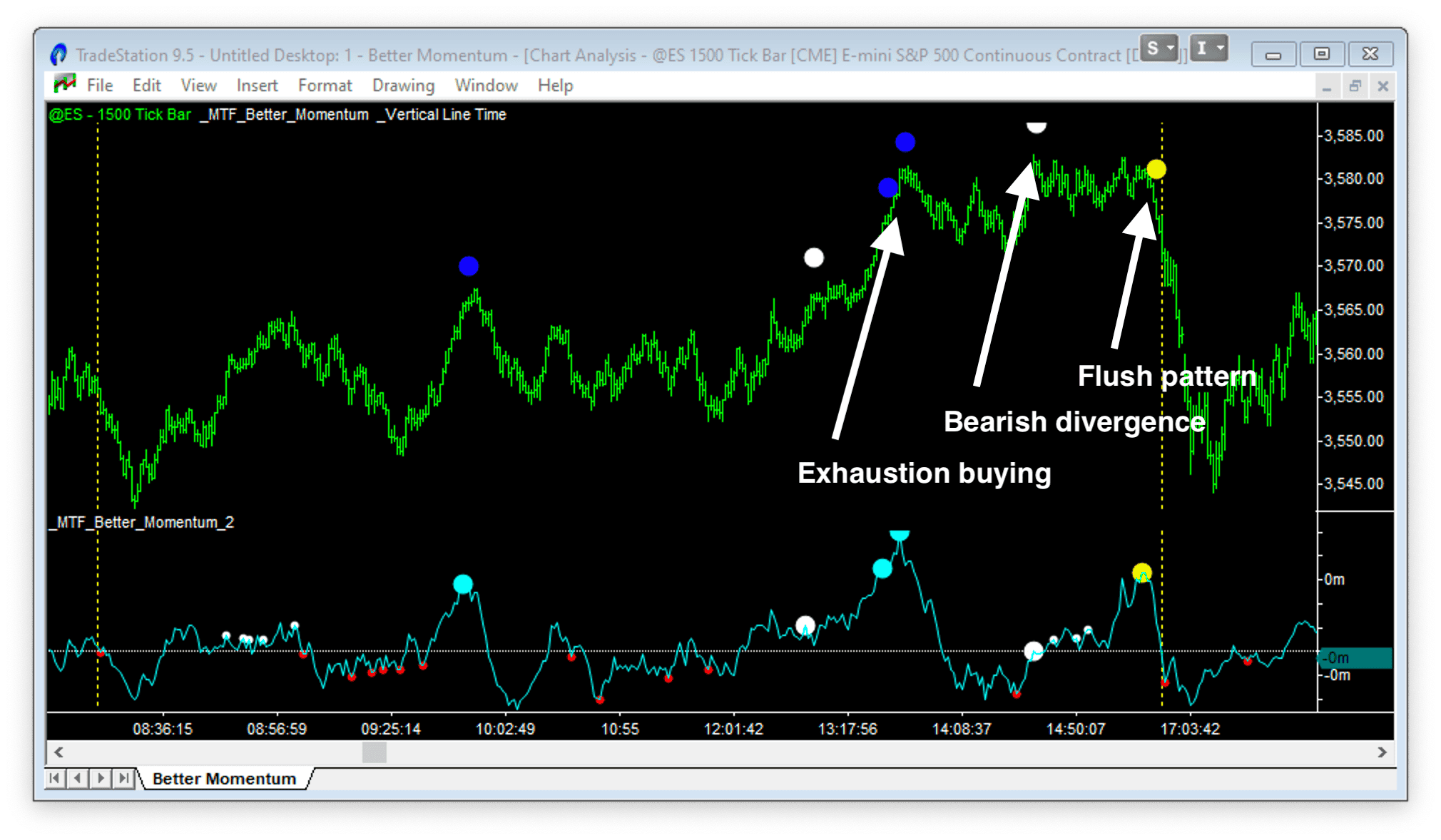
The sequence at tops: Exhaustion Buy > Bearish Divergence > Flush (yellow dot) > Decline
The sequence at bottoms: Exhaustion Sell > Bullish Divergence > Flush (yellow dot) > Rally
How to Trade with Volume Momentum
Better Momentum is powerful on its own, but it’s most effective when combined with non-correlated confirmation.
The Triple Signal: High Probability Setup
A Triple Signal occurs when three distinct conditions align:
- Better Momentum shows Exhaustion + Divergence (volume exhaustion)
- Better Pro Am shows Professional activity at the turn (smart money stepping in)
- Better Sine Wave shows Oversold or Overbought (price cycle exhaustion)
When volume exhaustion, price cycle exhaustion, and professional buying/selling all align – that’s a high probability trade.
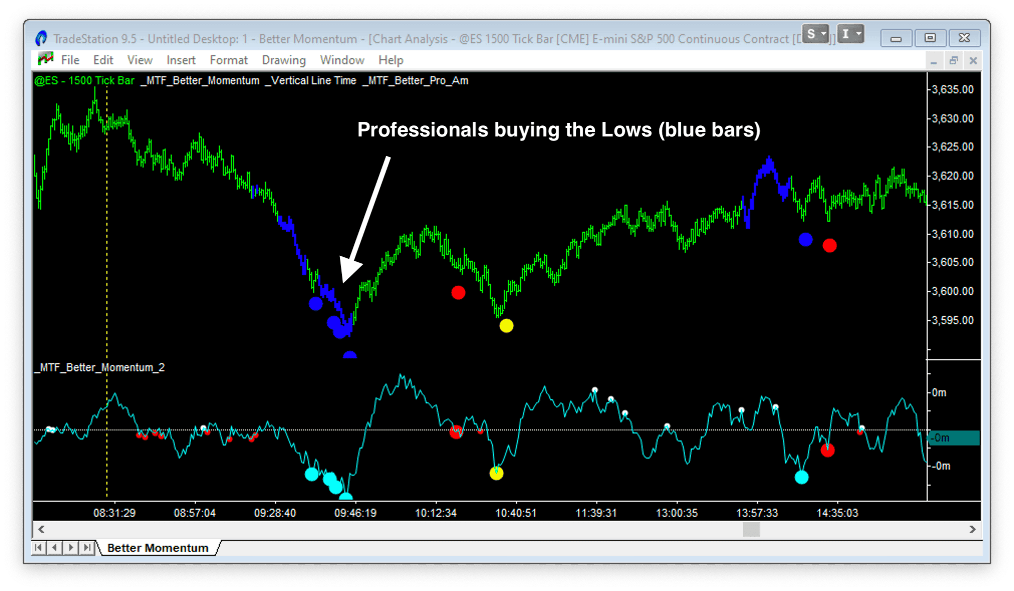
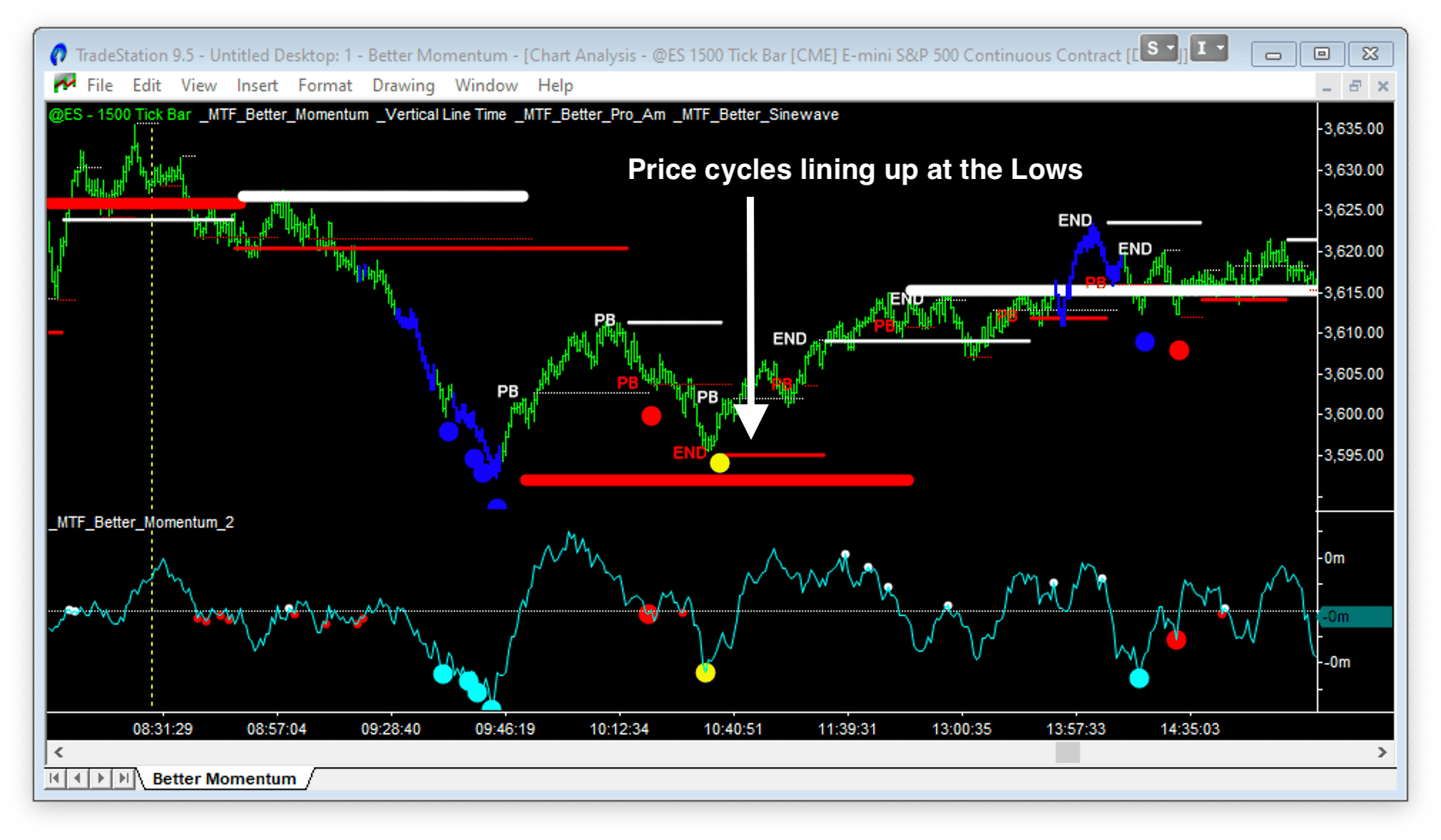
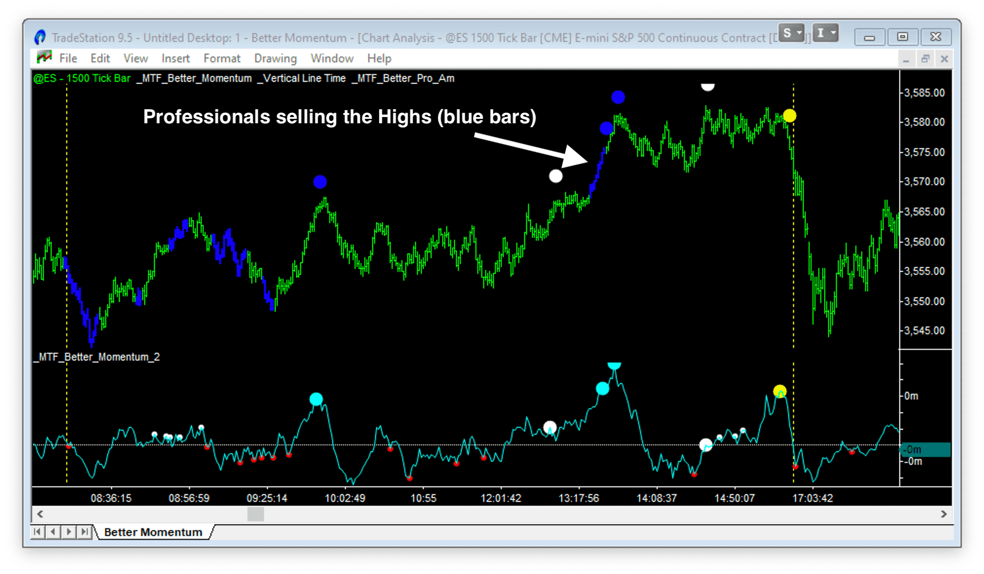
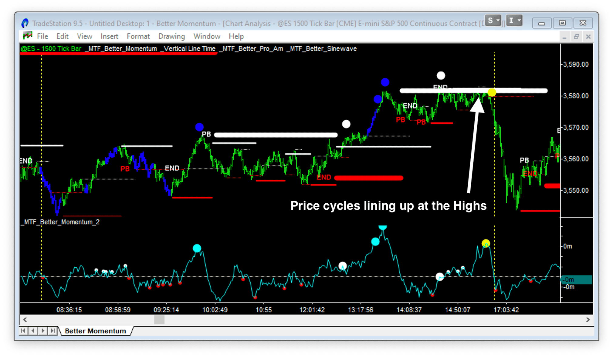
The four charts below show this in action:
At the bottom:
- Better Momentum shows Exhaustion Sell followed by Bullish Divergence
- Better Pro Am shows Professionals buying the lows (not amateurs)
- Better Sine Wave shows Support cycles lining up in multiple timeframes
At the top:
- Better Momentum shows Exhaustion Buy followed by Bearish Divergence
- Better Pro Am shows Professionals selling the highs
- Better Sine Wave shows Resistance cycles lining up
Pullback Trades: “Under the Lip”
After a momentum breakout, the market often retraces to test the breakout level.
The volume momentum indicator helps you confirm if the pullback is weak – low momentum on the retracement, while Better Pro Am confirms professionals are still supporting the move. This is trading “under the lip” of the professional trailing stop.
Weak momentum pullback + professional support = entry opportunity.
Spotting False Moves: Short Covering Rallies
Here’s a pattern that separates experienced traders from amateurs:
If you see an Exhaustion Buy signal without a preceding Exhaustion Sell, be cautious. This often indicates a short covering rally rather than a genuine trend change.
The move is being driven by stops getting triggered, not by new aggressive buying. The market hasn’t gone through the full exhaustion-divergence-flush sequence at the lows. The rally may not have legs.
The same logic applies in reverse: an Exhaustion Sell without a preceding Exhaustion Buy at the highs may be long liquidation, not the start of a real downtrend.
Practical Usage Tips
Timeframes
Better Momentum is fractal – it works on all timeframes:
- Tick charts (500, 1500 tick)
- Minute charts (5m, 15m, 45m, 135m)
- Daily and weekly charts
The signals mean the same thing regardless of the timeframe. Higher timeframes show larger moves; lower timeframes show more granular activity.
Zero Line Dynamics
Watch for momentum to come back to the zero line and get rejected. This often signals continuation of the current trend.
If momentum crosses zero decisively, the character of the market has changed.
Trendlines on Momentum
You can draw trendlines directly on the momentum histogram. A break of a momentum trendline often precedes a break in price trend – giving you early warning.
Unstable Patterns
When Better Pro Am shows a “Rambo” pattern (amateur activity) combined with an Exhaustion pattern on Better Momentum, the setup is unstable. Expect a sharp reversal.
Amateurs piling in at exhaustion = fuel for the move against them.
Best Volume Momentum Indicator for Day Trading
One problem with day trading is finding indicators that reach “steady state” quickly at the Open.
Most day traders use 2-, 3-, or 5-minute bars and must wait for opening activity to settle. Their indicators need time to adjust from quiet pre-market activity to post-open volatility.
Tick charts solve this problem. They compress low-activity periods and expand high-activity periods. A 500 tick bar in the pre-market represents the same amount of activity as a 500 tick bar during the Open.
Using a volume momentum indicator on tick charts makes patterns directly comparable between low-activity (pre-Open) and high-activity (Open and post-Open) periods. No adjustment period needed.
Volume Momentum for Stocks, Forex, and Futures
Better Momentum works on all markets and timeframes. Here are examples of daily charts of AAPL, Euro futures, and Crude Oil futures:

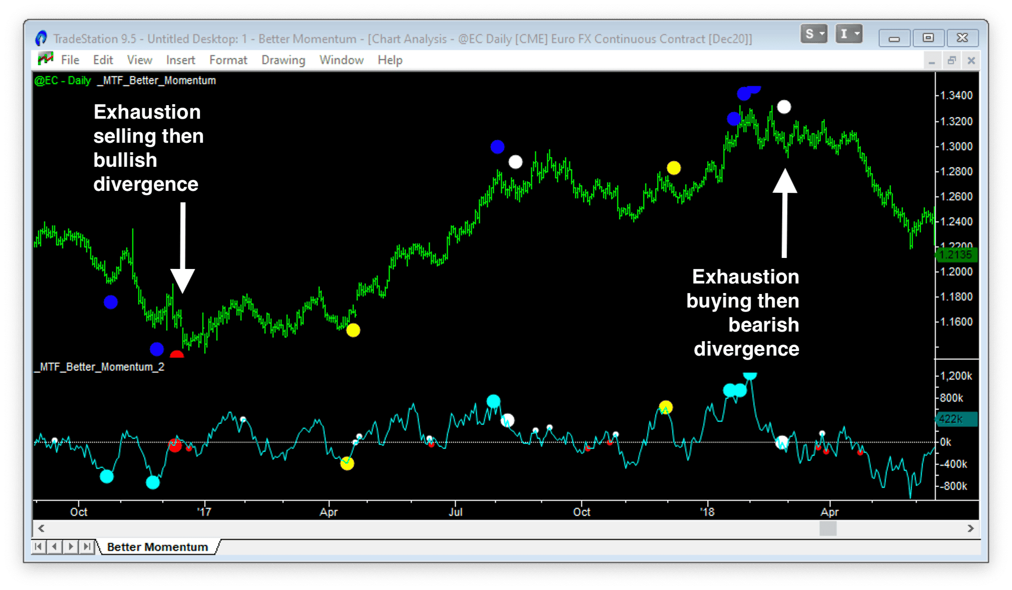
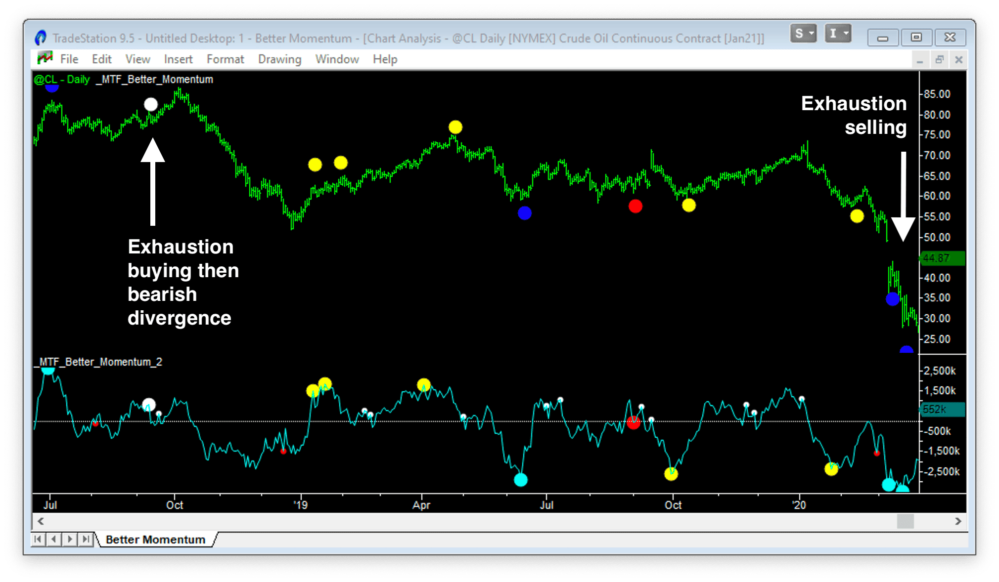
The Exhaustion and Divergence patterns are highlighted. These show high-probability turning points generated in real time with no back-plotting.
A Note on Forex
Cash forex symbols lack detailed volume data. The best you can do is use tick count as a proxy for total volume – and this is not close to the volume traded at the bid/ask. However, forex futures contracts traded on the CME do have detailed volume data, though they account for less than 20% of total forex volume.
More info in this article: Do the ‘Better’ Indicators Work on Forex? Yes
Better Momentum Indicator Settings
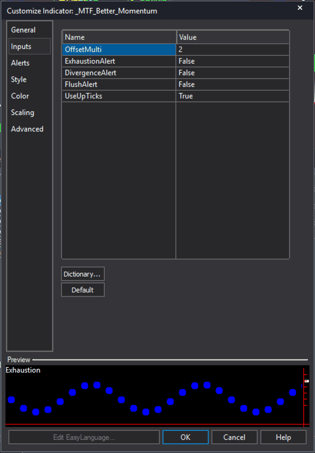
On the left is a screenshot of the Better Momentum indicator settings:
OffsetMulti – Sets how far from the price bars the indicator plots the signal dots.
Exhaustion / Divergence / Flush Alert – Tells the indicator to trigger an alert when a signal is generated.
UseUpTicks – Tells the indicator to calculate volume momentum based on volume traded as bid/ask. If this data is unavailable, the indicator will calculate a proxy based on total volume and OHLC.
FAQs
A volume momentum indicator measures the net buying and selling pressure in a market, rather than price change. Traditional momentum indicators like RSI, Stochastic, and MACD calculate momentum based on price differences over time. A volume momentum indicator instead tracks whether volume is occurring on the bid (selling) or ask (buying) side, showing you the actual force driving price movement. This gives an earlier warning of trend exhaustion and reversals because volume shifts typically precede price turns.
RSI, MACD, and other traditional momentum indicators are derived from price data and measure how fast price changes over a set period. A volume momentum indicator measures something fundamentally different: the balance between buying volume (trades at the ask) and selling volume (trades at the bid). Because volume activity often precedes price movement, a volume momentum indicator can identify exhaustion and divergence patterns before they show up on price-based indicators. You’re measuring the cause of market moves rather than the effect.
Better Momentum calculates the net buying and selling. So the scale of the axis is net volume for an index or net contracts traded for futures. On a typical day trading chart of the Emini, Better Momentum will oscillate between a maximum buying value of +5,000 contracts and a minimum selling value of -5,000 contracts.
The red dots indicate Bullish Divergence. The white dots indicate Bearish Divergence. The large dots show the first divergence signal after an Exhaustion signal. The small dots show the subsequent Divergence signals. The first Divergence signals are most important, and in more recent versions of the indicator, the small dots have been removed.
The first Divergence signals are identical on Better Momentum and the histogram, Better Momentum 2. However, they appear on different bars. Better Momentum plots the signals exactly as they are generated. However, Better Momentum 2 plots the signals on the peaks/valleys of the Better Momentum line plot that trigger the Divergence patterns.
Modern data feeds split volume into upticks (traded at ask) and downticks (traded at bid). This gives a more accurate picture of buying vs. selling pressure. If your data doesn’t support this, the indicator uses proxies based on OHLC data.
What Traders Are Saying About Better Momentum
I love Better Momentum. It is an integral part of my trading.
Doug B.
Better Sine Wave is fantastic; Better Momentum is fantastic.
BoB V.
I love Better Momentum – it has changed my view of the price/volume structure forever.
Ray M.
The Better Momentum indicator has become my most valuable trading tool. Well done!
Jack B.
The Better Momentum indicators are really great – I really LOVE the Better Momentum indicator – I think it is fantastic.
Allan R.
You make volume as visual as price and I agree with you about its impact on trading. Love your Better Momentum indicator. I am looking daily and weekly with stocks.
Ralph R.
Better Momentum seems to do the best for me. It gives me confidence to hold thru an adverse move seeing when the vol. diverges. It’s like having an ultra sound of the price enabling me to see what is below the surface of the price action. I can’t believe I waited so long to buy your indicators.
Brian C.
Thank you for the Better Momentum indicator! I really find that I can look at CL charts in a more structured way and feel less bewildered. This is huge – I am much more confident now with this indicator!
James K.
Summary
Traditional momentum indicators measure price. A volume momentum indicator measures the actual driving force – buying and selling volume.
Key takeaways:
- Volume leads price. Exhaustion in volume shows up before price turns.
- Exhaustion signals mark climaxes. Don’t trade them – wait for confirmation.
- Divergence signals confirm reversals. Price lower, momentum higher = bullish setup.
- Flush patterns clear the last weak hands. Often the final low/high.
- Combine with non-correlated indicators. Triple Signals offer the highest probability.
- Works on all markets and timeframes. Tick charts are ideal for day trading.
Stop measuring the result. Start measuring the cause.

