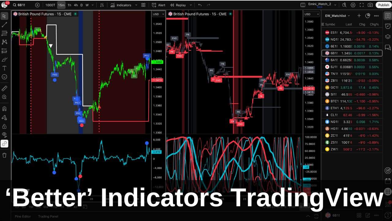
The Better Sine Wave indicator is my adaptation of John Ehlers’ Hilbert Sine Wave – a cycle-based oscillator that uses digital signal processing to measure cyclical energy in market prices.
Ehlers’ original version, published in Rocket Science for Traders, does something most indicators can’t: it distinguishes between cyclical and trending price activity. When the market is in a cycle, the indicator plots a normal sine wave with crossovers at turning points. When the market is trending, the lines go “out of sync” and stop crossing – telling you not to fade the move.
I first came across the Hilbert Sine Wave over 20 years ago and was hooked. It describes market structure more elegantly than moving averages or trend lines ever could. Since then, I’ve built on the raw cycle measurement and added practical trading signals – that’s why I call my version “better”.
This guide explains how the Hilbert Sine Wave works, what makes it unique, and what Better Sine Wave adds: smart support/resistance levels, trend detection, end-of-trend signals, and multi-timeframe structure.
Table of Contents
Use the links above to jump to the Hilbert Sine Wave Indicator topics that interest you.
How the Hilbert Sine Wave Works (Ehlers’ Original)
The indicator’s origin story spans mathematics and engineering. David Hilbert (1862-1943) was a German mathematician who developed the Hilbert Transform – a method for extracting phase information from signals. John Ehlers, an engineer with an interest in digital signal processing, applied this transform to market data and published his findings in Rocket Science for Traders.
The core idea: market prices contain cyclical patterns buried in noise. The Hilbert Transform extracts the dominant cycle from the price data, producing two lines: a Sine Wave and a Lead Wave (sometimes called the “lead line” because it leads the sine wave by 45 degrees).
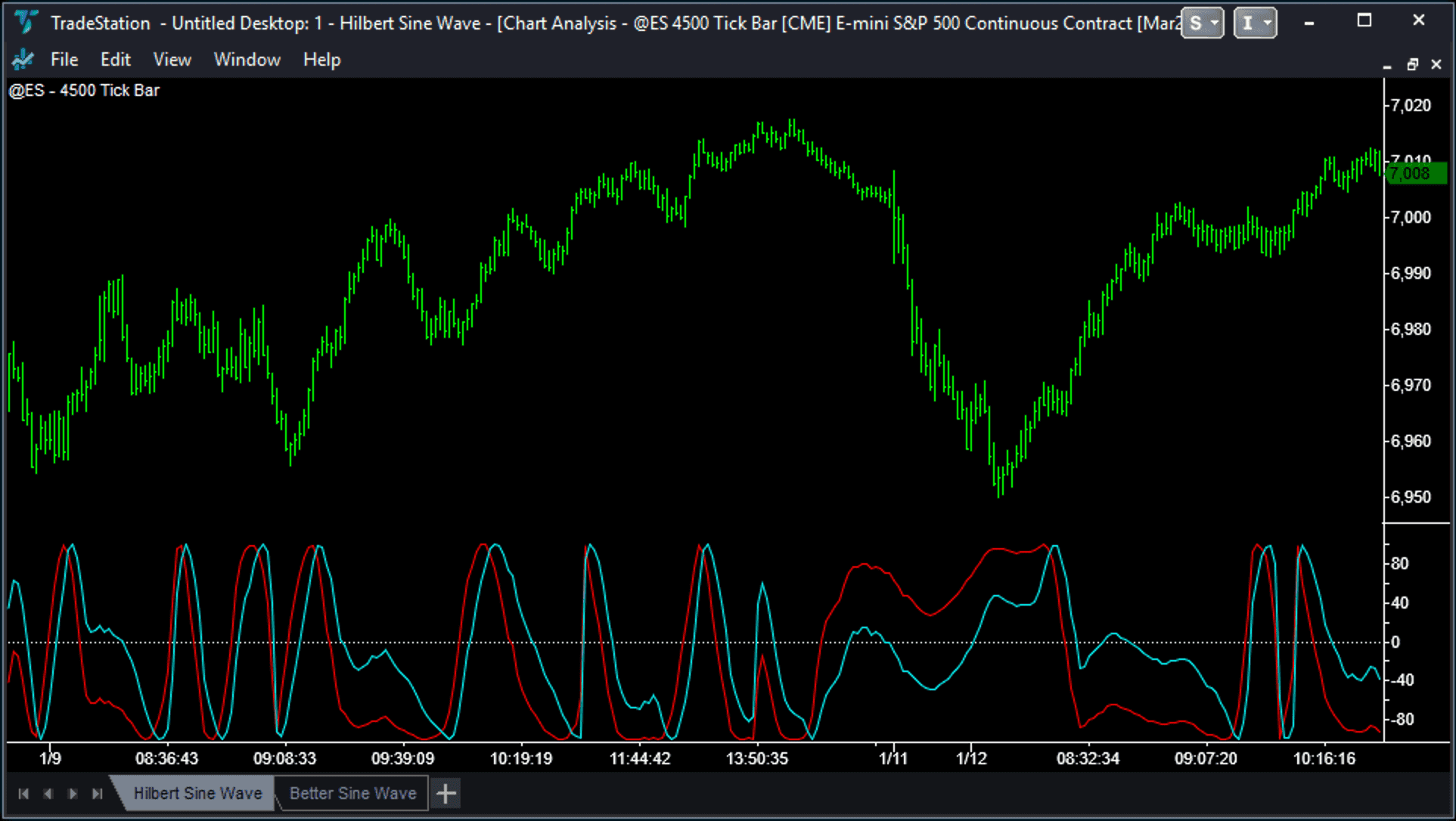
What the Two Lines Represent
The indicator plots as a pair of oscillating lines in a separate pane below the price:
- Sine Wave (blue line): Represents the current position within the dominant market cycle
- Lead Wave (red line): A “look-ahead” line that anticipates where the sine wave is heading
When these lines cross at extreme levels (+100 or -100), it signals a potential cyclical turning point. A cross at +100 suggests overbought conditions; a cross at -100 suggests oversold.
When It’s Useful
In range-bound, cycling markets, the Hilbert Sine Wave works well. Price bounces between support and resistance, the sine wave oscillates predictably, and crossovers at extremes identify turning points with reasonable accuracy.
This is the indicator’s strength: it tells you where you are within a cycle. Are we near a cyclical top? A cyclical bottom? The middle of a swing?
What the Original Doesn’t Give You
The Hilbert Sine Wave tells you the market’s mode – cycling or trending. That’s valuable. But it stops there.
When the indicator shows a market in a cycle, you know the price is range-bound. But where are the support and resistance levels? The original doesn’t plot them. When the lines go “out of sync” and signal a trend, you know not to fade it. But when does that trend end? The original doesn’t tell you.
That’s what Better Sine Wave adds:
- Smart Support/Resistance levels – plotted directly on price during cycling phases
- Trend coloring – trend calculations based on breaks of S/R levels
- Pullback and End of Trend signals – so you know when the trend move is exhausted
- Multi-timeframe structure – see three market frequencies at once
The original tells you the market’s mode. Better Sine Wave tells you cyclical turning points, breaks into trend and when the trend is about to end.
The Three Timeframes (Market Structure)
Markets “resonate” in three different frequencies, changing continuously between them. This is why fixed-length indicators often fail – they’re tuned to one frequency while the market has moved on and is now operating in another frequency.
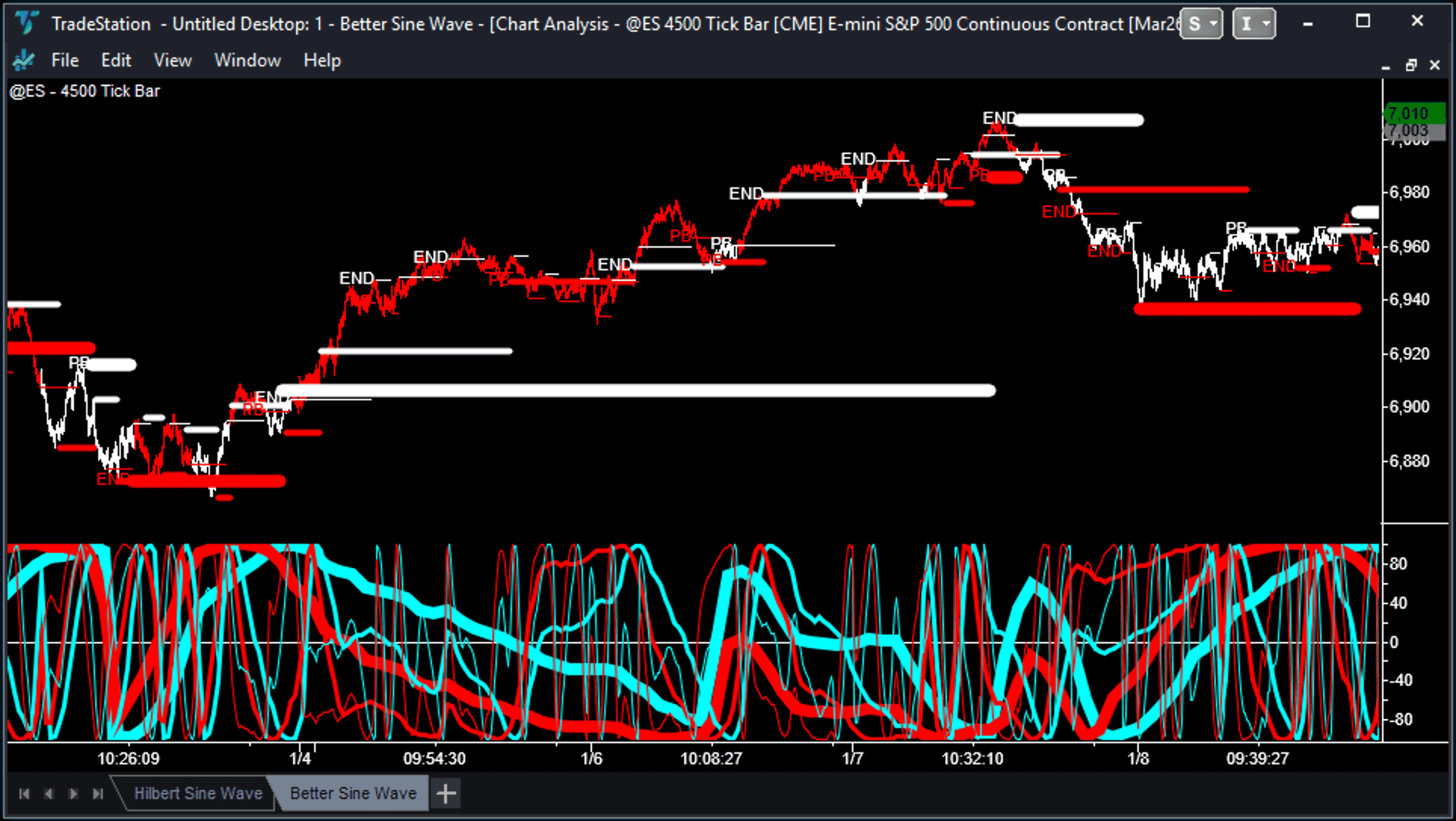
The Three Frequencies
- Lowest Timeframe (thin lines): The noise and immediate price action – small swings within larger moves
- Intermediate Timeframe (medium lines): The swing trend – the move most day traders are trying to capture
- Highest Timeframe (thick/bold lines): The major trend – these trends turn into big winners (if you can ride them)
Better Sine Wave uses a factor of 3 to switch between each timeframe. If your base chart is a 500-tick chart, the intermediate timeframe represents roughly 1,500 ticks (= 500 x3) of structure, and the highest timeframe represents roughly 4,500 ticks (= 500 x3 x3).
The Critical Insight: Trend = Cycle in a Higher Timeframe
Here’s the concept that changes everything:
A trend in a lower timeframe is a cycle in a higher timeframe.
That explosive move you’re riding on your 500-tick chart? Zoom out to the 4,500-tick chart, and it’s just one leg of a larger cycle move – from support to resistance.
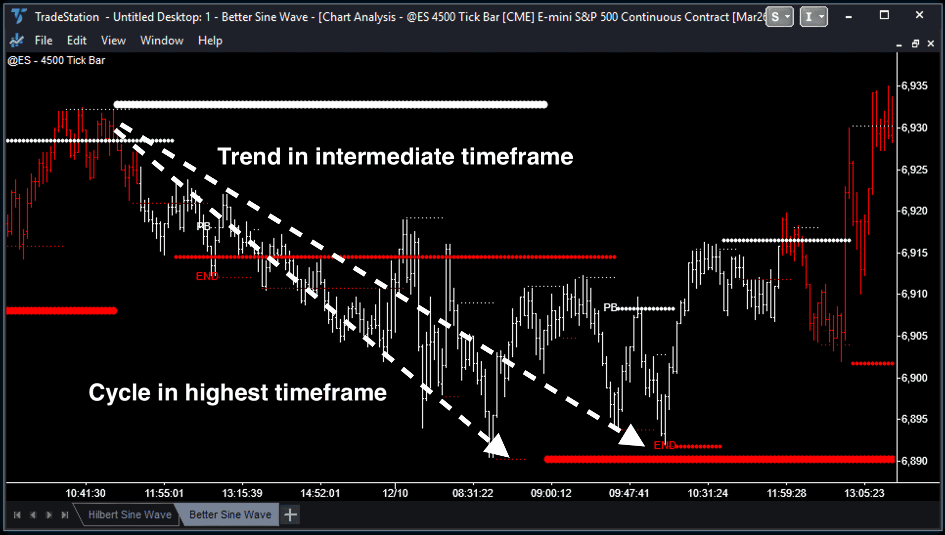
This means:
- When you see End of Trend signals in a lower timeframe synching with cyclical support or resistance in the highest timeframe, pay attention.
- If the trend move is strong, you will see End of Trend signals “ripple” from the lowest timeframe up through the intermediate and into the highest timeframe; the entire move is mathematically exhausted
- When support/resistance from all three timeframes cluster at the same price level, something significant is about to happen
Key Signals: Reading the Chart
The Better Sine Wave produces several distinct signals. Learning to read them quickly is essential.
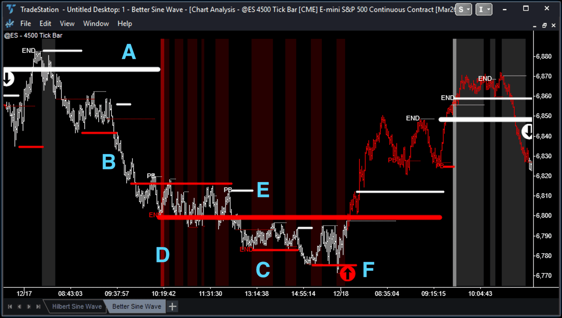
A. Support & Resistance Levels
Unlike the original Hilbert Sine Wave, which only shows oscillator crossovers, the Better Sine Wave plots “smart” support and resistance levels directly on price.
- Red lines below price: Support levels
- White lines above price: Resistance levels
- Line thickness: Indicates timeframe – thin lines for the lowest timeframe, medium for intermediate, thick for highest
These aren’t simply plotted when the cycle lines cross. The Better Sine Wave starts looking for support or resistance when the lines cross, but only plots them once price action has confirmed. This leads to more accurate support and resistance levels and fewer false signals.
B. Trend Definition (Bar Colors)
The indicator colors price bars showing market trend – but takes into account the market structure and dominant timeframe:
- Red bars: Strength/Uptrend – price is breaking above cyclical resistance
- White bars: Weakness/Downtrend – price is breaking below cyclical support
The key insight: trend is defined by breaks of support/resistance. As long as bars remain red (even during a dip), the uptrend structure is technically intact. The indicator keeps you in trades longer than your emotions want to.
C. Background Shading (OBOS)
Background colors show overbought/oversold conditions across timeframes:
- Dark red background: Oversold – and support levels showing in all three timeframes
- Gray background: Overbought – and resistance levels showing in all three timeframes
- Black background: Transition zone – neither extreme
D. Big Things Happen at Triples (BTHAT)
This is one of the most powerful signals.
The Setup: When support or resistance levels from ALL THREE timeframes (Low, Intermediate, High) signal at the same time and cluster closely together at the same price level.
The Implication: This represents a massive concentration of cyclical energy. Price cannot ignore this level.
The Outcome: Expect either a Big Bounce (the level holds and price reverses strongly) or a Big Break (the level fails and price trends explosively in the breakout direction).
BTHAT signals require confirmation – you need to see whether price bounces or breaks. But once you have that confirmation, the resulting move is typically significant.
E. Pullback (PB) and End of Trend (END) Signals
A Trend move starts once the price has broken above a resistance level (or below a support level in a downtrend). The Trend move ends when a final cyclical “flourish” forms. These last two cyclical turns are marked on the chart with “PB” to show a final Pullback. Then the final move is marked with “End” to show the End of the Trend.
When you see “End” on the highest timeframe, the trend has mathematically exhausted itself. This doesn’t mean price immediately reverses – it means the trending energy has dissipated and the market is transitioning back to cycling/congestion mode.
F. Sign of Strength and Sign of Weakness (Arrows)
After a Big Things Happen at Triples signal, we’re always looking for the next change in trend. When the trend reverses, and bars change from white to red (or red to white), Better Sine Wave signals a Sign of Strength (or Weakness), marked with an arrow.
This isn’t necessarily an entry signal, and in my trading, I often wait for the second or third arrow signal. Plus, look for confirmation from Better Pro Am and Better Momentum.
Trading Rules: Entry and Exit
Based on the signals above, here are concrete trading rules.
Entry Signals
1. Reversal Signal (BTHAT Setup)
- Wait for BTHAT (triple S/R confluence)
- Wait for EoT signals to ripple through timeframes
- Enter when all trending energy is exhausted and price shows first sign of reversal
- This catches major turns from trend to cycle mode
2. Retracement Signal #1 (Pullback to Support/Resistance)
- In established trend (colored bars confirm direction)
- Wait for pullback to S/R level
- Enter when price bounces off S/R with minimal overshoot
- Target: next S/R level in trend direction
3. Retracement Signal #2 (Second Cyclical Turn After EoT)
- After EoT signal appears
- Wait for first cyclical turn (this often fails or produces small move)
- Enter on the second cyclical turn after EoT
- This catches the start of the new trend move
Exit Signals
1. Profit Target: Next S/R Level
- Measure from entry to next S/R level in trend direction
- Take partial profits at intermediate S/R
- Take remaining profits at highest timeframe S/R
2. Trailing Stop: EoT on Intermediate Timeframe
- When EoT appears on intermediate timeframe, tighten stops
- Exit remaining position when EoT appears on highest timeframe
The Market Cycle
Remember the overall pattern: Congestion ? Expansion ? Congestion
Or in indicator terms: Cycle ? Trend ? Cycle
Your job is to identify where you are in this sequence and trade accordingly.
Signal Checklist
Before entering a trade, confirm:
- ? Price at S/R cluster (triple = higher probability)
- ? Bar color confirms direction
- ? EoT has rippled through lower timeframes (for reversal trades)
- ? Not fighting higher timeframe trend
- ? Volume/momentum confirmation from Better Momentum or Better Pro Am (optional but increases win rate)
Better Sine Wave: What’s Different
The Better Sine Wave is my adaptation of John Ehlers’ original Hilbert Sine Wave indicator. After 20+ years of trading with this indicator, I believe the additions to the original indicator significantly help traders understand market structure, trends and cycles.
Ehlers Original vs. Better Sine Wave
| Feature | Ehlers Original | Better Sine Wave |
|---|---|---|
| Trend Detection | None (assumes cycles) | Rules-based trend coloring (red/white bars) |
| S/R Levels | Crossovers only | “Smart” multi-timeframe S/R on price |
| Timeframes | Single | Three (Low, Intermediate, High) |
| Pullback/End of Trend | No signal | Trend exhaustion detection |
| Forex Compatibility | Cycle “glitches” | Clean signals on all instruments |
| User Optimization | No code optimization needed | No code optimization needed |
Key Improvements
1. Trend Detection
The original assumes everything is cyclical. Better Sine Wave identifies when market structure shifts from cycling to trending mode, preventing false overbought/oversold signals during strong trends.
2. Three-Timeframe S/R
Instead of just oscillator crossovers, you get support and resistance levels from three timeframes plotted directly on the price. This makes trend setups visible and tradeable.
3. End of Trend Signals
The indicator explicitly marks when trending energy exhausts, so you know when to take profits or look for reversals.
4. No Optimization Required
Use default settings. The indicator adapts to market conditions without manual parameter tuning.
FAQs
MESA (Maximum Entropy Spectral Analysis) is another approach developed by John Ehlers for cycle analysis. Both attempt to identify market cycles, but use different algorithms. The MESA approach measures the dominant cycle period; the Hilbert approach measures the phase within a cycle. In practice, they produce similar but not identical signals. Better Sine Wave is based on the Hilbert approach.
For day trading, tick charts produce cleaner signals. Tick charts compress low-activity periods (lunch, overnight) and expand high-activity periods (open, close, data releases), creating more consistent cyclical patterns. For swing or position trading, time-based charts (135-minute, daily, weekly) work well.
The Better Sine Wave indicator works on ALL timeframes and ALL markets:
- Futures (ES, NQ, CL, GC, etc.)
- Stocks (AAPL, TSLA, etc.)
- Forex (EUR/USD, GBP/USD, etc.)
- Indices
- Crypto, etc.
The indicator is designed to work with default settings – no fine-tuning for different markets or timeframes. The only adjustments most traders make are to colors and to enable or disable specific visual elements based on preference. Key settings:
- SupportColor and ArrowColorUp: Red
- ResistanceColor and ArrowColorDown: White
- ArrowSize: 24
- ShadePercent: 15
- PlotSR (and alert): True
- PlotPaintBars (and alert): True
- PlotBackground: True
- PlotBTHAT (and alert): True
- PlotArrows (and alert): True
Better Sine Wave doesn’t have any input settings to adjust or fine-tune. So just add the indicator to any chart. You can turn on or off the different signals, though (S/R, trend, BTHAT, arrows, etc.). For day trading ES futures, I use three tick-chart timeframes: 500, 1,500 and 4,500. The 500 tick chart for entry signals, the other two timeframes for the big picture and trend.
BTHAT refers to when support (or resistance levels) from all three timeframes (low, intermediate, high) signal at the same time. This syncing of levels represents concentrated cyclical energy. The result is either a strong bounce (level holds) or an explosive breakout (level fails). Either way, the move is significant.
Watch for End of Trend (EoT) signals to “ripple” through the timeframes. First, EoT appears on the lowest timeframe, then on the intermediate timeframe, then on the highest timeframe. When EoT appears on multiple timeframes, trending energy is exhausted, and the market is transitioning back to cycling/consolidation mode.
Better Sine Wave is available for:
- TradeStation
- NinjaTrader
- MultiCharts, and
- TradingView
If your platform includes a standard Hilbert Sine Wave or MESA Sine Wave indicator, you can approximate some of the signals:
- Look for crossovers at +100/-100 extremes
- Add a trend filter (ADX or similar) to avoid false signals during trends
- Manually identify S/R from swing highs/lows
However, the multi-timeframe S/R, trend detection, and EoT signals are proprietary to Better Sine Wave.
What Traders Are Saying About Better Sine Wave
It may be the best indicator I ever bought.
David B.
The Better Sine Wave SR indicator has an amazing way of catching tops and bottoms.
Bob V.
I think your Better Sinewave is close to a holy grail indicator.
Doug C.
The Better Sine Wave SR shows major inflection points in the market that other indicators just don’t pick up.
George D.
Your Better Sine Wave indicator has been a breakthrough in my day trading. I am consistently pulling 2-4 pts per contract a day out of the market. You have helped make day trading fun for me again.
Isaac M.
I paid for the Better Sine Wave indicator on my first trade.
Michael L.
Better Sine Wave is the best indicator I have come across. Will never trade again without it!
Ganesh B.
Verrrry nice! Very, very nice, I must say. I’ve never seen Ehlers’ Sine Wave combined with what I would call a quasi-Elliott interpretation. What a marvelous idea!
Frank J.
Love the Better Sine Wave indicator on tick charts – it picks a ton of great trades. I have been investing/trading for 15 years and your indicators have re-lit the fires under my feet.
John R.
I am amazed at what this indicator can do. It really does work for all time frames and all markets.
Victor H.
Summary
The Hilbert Sine Wave indicator, developed by John Ehlers, uses digital signal processing to measure cyclical energy in markets. The Better Sine Wave indicator improves on the Hilbert Sine Wave by adding:
- Three-timeframe support/resistance levels
- Rules-based trend detection (not just cycle crossovers)
- End of Trend signals that identify local market maxima/minima
- BTHAT markers for high-probability reversal zones
The result is an indicator that defines market structure – whether cycling or trending – across any timeframe and any market.
If there were ONE indicator I’d recommend to traders, it would be the Better Sine Wave. It puts everything in context: showing whether we’re in consolidation waiting to break out, or in the middle of a trend waiting for exhaustion.

