Can the technical analysis of one market help you trade another? Yes, maybe.
Intermarket Analysis is the comparison of potentially related markets. For example:
- S&P500 and 30 Year Treasury Bonds
- 30 Year Treasury Bonds and Gold
- S&P500 and Japanese Yen
- Shanghai Composite Index and Aussie Dollar, etc.
Often you’ll see two markets moving together – one seemingly driving the other. These moves can last weeks or months and will be pointed to by analysts as the “reason” one market is going up or going down. Then gradually the lock-step trend starts to fade and then disappears altogether.
Was this intermarket relationship a mirage? Was there really a causation-meets-correlation meeting of the two markets?
The problem with TradeStation
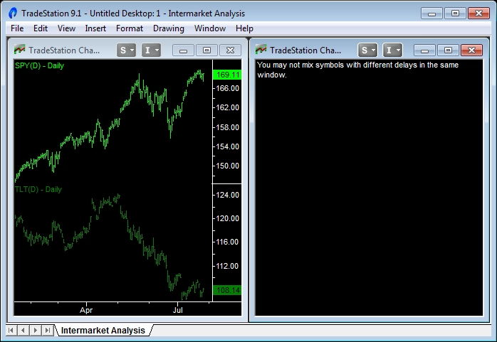
The problem with using TradeStation for any Intermarket Analysis is the dreaded “You may not mix symbols with different delays in the same window” error code. That’s exactly what you’ll get if you try to add 30 Year Treasury Bond Futures (symbol US) to an Emini chart (symbol ES). The problem arises because the data comes from two different exchanges – CBOT for Bonds and CME for the Emini. TradeStation says:
There are various ways around the problem – most of them quite complex and involving exchanging data between charts. However, I have found an easier solution. Read on for some tricks of the trade and useful equities vs. bonds indicators.
Using ETFs for Intermarket Analysis
The solution to the problem is to find market symbols from the same exchange. With the explosion in the number of Exchange Traded Funds (ETFs) it is usually possible to find ones that track the underlying markets you are interested in.
For the Emini the obvious choice is the SPDR (symbol SPY) ETF traded on the AMEX exchange. For the Bond market the best choice is the iShares Lehman 20+ Year Treasury Bond ETF (symbol TLT), also traded on the AMEX exchange.
In the left panel of the chart above, daily data for the SPY and TLT symbols have been plotted quite happily on the same chart. However, in the right panel you get the dreaded “mix symbols” error code when plotting the ES and US symbols.
Are the Emini and Bond markets correlated?
The answer is sometimes yes and sometimes no. Correlation between the two markets can go as high as +60% (correlated) or a low as -60% (negatively correlated). You can add the in-built TradeStation correlation indicator on a chart of SPY and TLT to see this for yourself.
There are 2 opposing factors that drive the Bond and Stock markets at different times:
- Stocks and Bonds move together: Interest rates might be falling and causing Bond prices to rise. The stock market might view the lower interest rates as encouraging for the economy and respond with higher stock prices. Alternatively, rising interest rates will cause Bond prices to fall and the stock market might view the tightening as negative for the economy and stock prices. In these cases correlation between the two markets is positive as they are moving in sync.
- Stocks and Bonds move against each other: Stocks and Bonds are also alternative investment vehicles. If the stock market is rising strongly it might encourage Bond investors to cash out and put their money in the stock market and thereby cause Bond prices to fall. The smart money also moves money into Bonds before stock market crashes. And after a stock market panic investors rush for the safety of Bonds and push Bond prices even further up. In these cases the two markets are negatively correlated as they are moving in opposite directions.
Measuring differences between the Emini and Bond markets
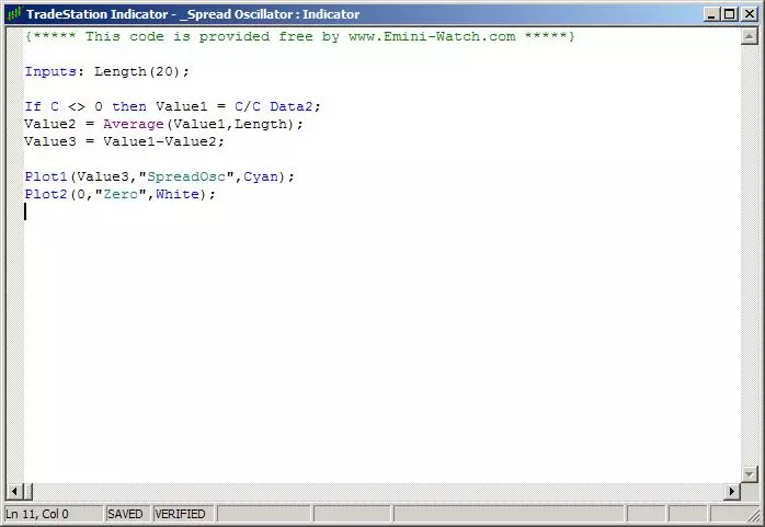
With SPY and TLT plotted on the same chart we can compare price movements. A popular oscillator is shown in the screen grab above. In this case a ratio of SPY and TLT is calculated and this value compared to a moving average of the ratio.
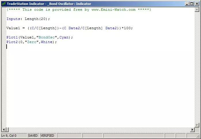
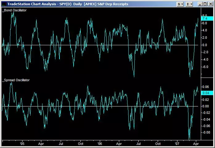
I prefer to use another measure of relative price movement. The screen grab below shows TradeStation EasyLanguage code for my Bond Oscillator. Instead of using the ratio of SPY and TLT prices it calculates the difference in percentage movement. This indicator is more like a momentum indicator.
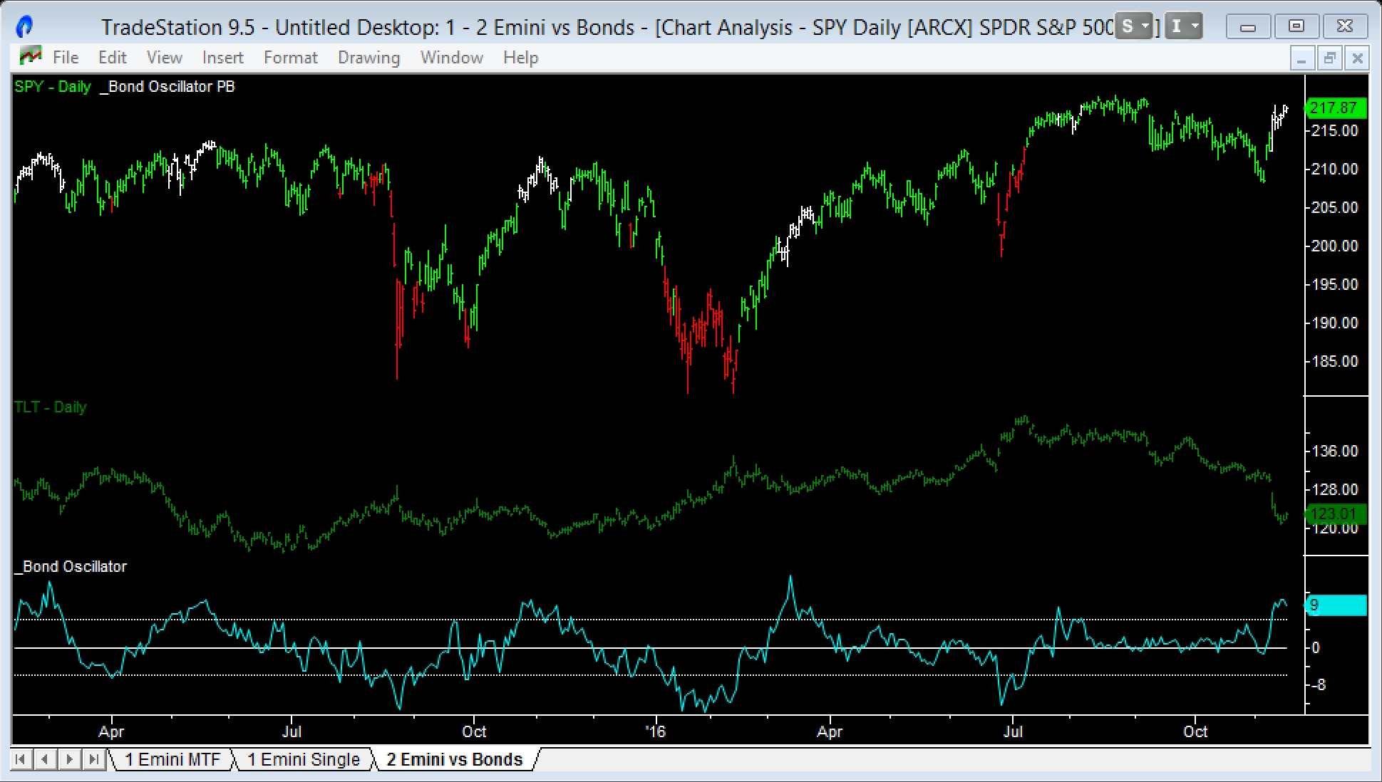
The two indicators are compared below. The Bond Oscillator (momentum type) is shown above and the Spread Oscillator (moving average type) is shown below. As you can see, the Bond Oscillator generates more defined turning points and is easier to trade.
The chart below shows the Bond Oscillator added to a 3 year chart of daily SPY prices. Spikes (up and down) in the oscillator show periods when the SPY is over or under-valued against Bonds. These periods can persist for some time – more so on the upside than the downside. To illustrate this a PaintBar has been added to highlight periods when the Bond Oscillator is above +5 (shown as white bars) and below -5 (shown as red bars).
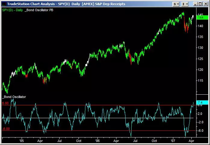
Rather than use extreme readings on the Bond Oscillator to enter trades, it is safer to wait until the Oscillator crosses the zero line after an extreme reading. This prevents entering the trades too early.
Another trick I have found using this indicator is to wait for an extreme Oscillator reading and then look for a large daily move in the opposite direction in the Bond market. For example, Bonds are in a down trend, the Bond Oscillator goes above +5 and then Bonds have a one day large up move. This pattern is signalling that professionals are taking profits at stock market highs and reaching for the safety of Bonds, hence driving Bond prices higher.
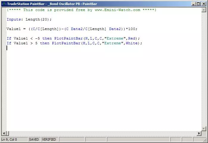
TradeStation EasyLanguage code for the PaintBar is shown in the screen grab above.
Bond market turning points and the Emini
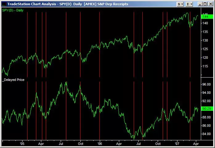
The last series of Bond Intermarket indicators are designed to highlight market turning points. I have found that there is a tendency for the Emini to lag the Bond market by approximately 20 days. To illustrate this point check out the chart above.
The SPY (Emini equivalent) is shown in the top of the chart and below it is TLT (Bond market equivalent) with closing prices shifted by 20 days. The red vertical lines show how turning points in the two markets (one delayed by 20 days) often line up. The neat thing about this analysis is that the Bond market turning points are known well in advance.
As an aside, this 20 day delay is also the reason I use 20 days as the look back period in the previous two indicators, Spread Oscillator and Bond Oscillator.
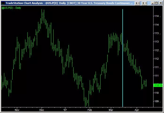
The chart below shows the state of the current Bond market (mid April 2007). A vertical line has been added showing where prices were 20 days ago. As you can see, since then the Bond market has declined steeply. If the 20 day relationship holds we may well see another turning point in the stock market. Only time will tell.
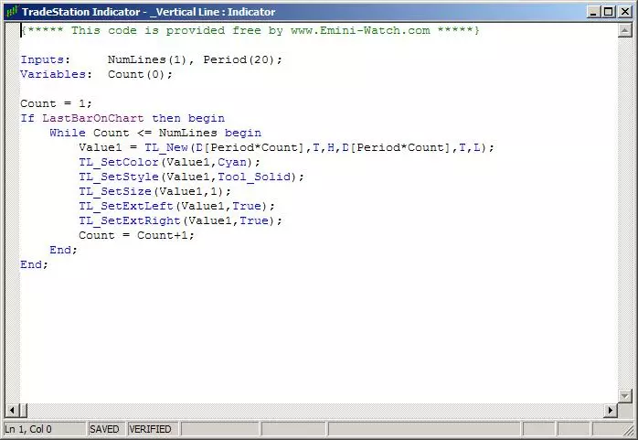
If you’re interested in following turning points in the Bond market you can use the indicator below to plot these vertical lines. The indicator allows multiple vertical lines of different frequencies to be plotted. Just vary the inputs NumLines (number of vertical lines) and Period (20 days, etc.). Make sure there’s enough back history in the chart to plot the lines though – if you ask for two 200 day lines and only have 300 days of history on the chart, the indicator won’t work!
Intermarket Oscillator for TradeStation
I hope this article on Intermarket Analysis and equities versus bonds was helpful to you. Click on the button below to download the TradeStation indicator code used in this analysis.
Click this link for more free indicator code.